As I note in the companion post to this one, today sees the launch of the fiftieth Daft Report, with a commentary by yours truly. To mark the occasion, and to mark five years of Ireland’s property market crash, Daft.ie and the All-Island Research Observatory at NUI Maynooth, have launched a property value heatmap tool. In this post, I’ll give an outline of what the tool is and does, and what we can learn from it.
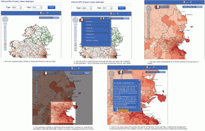
The heatmap tool is up and running on its own homepage. There are basically nine maps in there: house prices, rents, and yields (the ratio between the two), for 2007q2 (the peak), 2012q2 (now) and the change between the two periods. If you click on the image below it should open up in a new window and give you an overview of how to use the tool, which to be honest is pretty intuitive anyway. (The bookmarks are very handy – e.g. the shortcut to zoom in to Dublin – plus you can also set your own shortcuts.)

The tool is meant to be a public service – anyone can go on and find out typical prices and rents for the area they’re interested in, and how those have changed since the peak. The prices shown are like for like, weighted averages over a basket of five standardised property types, so the maps also show the contours of land value in the country (assuming for simplicity no variation in construction costs). (This should of course be incredibly useful to Government, if it is interested in implementing a site value tax… hint hint.)
Careful guys, here comes the science bit
The analysis that underpins all these figures is described in detail in a working paper of mine, which also outlines the main stylised facts of the structural changes in Ireland’s property market over the last five years. The paper sits in a literature, back in vogue after what’s happened in OECD housing markets in recent years, that tries to understand what happens in a bubble and crash.
In terms of methodology, all daft.ie listings, sales and rent, were taken for the period 2006Q1-2012Q2. Those whose location is known poorly (i.e. not to townland level) were removed, as were observations for 2008, to give discrete bubble and crash periods (2006-2007 and 2009-2012 respectively). Each listing was mapped, and then the greatest number of zones consistent with reasonable sample sizes in both bubble and crash periods was created. These zones are typically collections of CSO Electoral Divisions (outside cities) and Enumerator Areas (within cities). In the sales market, there are 1,117 zones while in the lettings market, there are 312 (mostly due to thin rural lettings markets in the bubble period).
In addition to its zone, each property was assigned to a regional market (Dublin, other cities, Leinster, Munster or Connacht-Ulster) and had rich information on size and type. These were interacted in a number of combinations (for the full specifications see the Working Paper), to allow not just the map of property values to vary between bubble and crash periods but also to allow differentials associated with particular property types and sizes to vary, not only between bubble and crash periods but also across regional markets.
So What?
That was the boring science bit. The conclusions are, happily, more interesting.
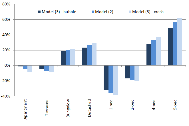
- In the sales segment, the marginal price of space rose substantially in the crash – put another way, the fall in price of a five-bedroom detached house (48% on average) was significantly smaller than that of a one-bedroom apartment (62%). The differential between these two properties increased from 118% to 164% nationally. An overview of the price differentials and how they changed between bubble and crash periods is given in the graph below.
- In the lettings segment, the opposite was the case: the marginal price of space fell in the crash. The differential between a five-bedroom property and a one-bedroom property narrowed from 97% to 82%.
- The geographic spread of both prices and rents was largely preserved across bubble and crash periods, falling only slightly in the models presented. The Gini coefficient of prices fell slightly (in Model (4), from 25% to 24%), similar to what happened that for rents (20% to 19%).
- As suggested by these Gini coefficients, it is clear that the spread of rents was significantly less than the spread in house prices in both bubble and crash periods. Most of this appears to be concentrated in high-amenity areas: while the 50:1 percentile ratios of prices and rents were similar (1.89 compared to 1.93), the 99:50 ratio was substantially greater in prices (3.02 compared to 1.86).

What does all this mean? Is this useful at all, besides having pretty maps? Well, from a research point of view, the contrast between the first and second findings above suggests a model where income and substitution effects apply in different situations. Income effects appear to dominate where there is no outside option (demand for accommodation is income-inelastic if you are a renter): space in the crash is a luxury for tenants. Where there is an outside option – many would-be first-time buyers held out during this period – substitution effects kicked in: if you are going to buy, you might as well buy big. An idea for future research is modelling tenure choice with the real estate cycle in mind.
Location is ultimately a short-hand for a bundle of amenities, ranging from labour and consumer markets to social and natural capital amenities. The final finding – that the geographic spread of rents is in some sense constrained at the upper end of the distribution – is consistent with either renters under-valuing certain amenities, for example due to search costs, or with buyers over-valuing those amenities, for example due to fear about future access to an amenity that is in fixed supply (e.g. access to schools).
Buyer over-valuation due to a desire to lock in access to amenities would reasonably be at its most acute in a bubble and be seen in pro-cyclical pricing of attributes and amenities. This is an issue that Ed Glaeser, one of the leading urban economists, has been writing about using U.S. data for the period 1996-2006. He and his co-authors find evidence of pro-cyclical pricing of amenities. The evidence here, however, certainly in relation to attributes, is that pricing was counter-cyclical, suggesting that it is renter under-valuation at work. (I explore this is more detail in another paper.)
Lastly, the price and rent series constructed in the course of this research extend naturally to a price-to-rent ratio for each of Ireland’s 4,500 Census districts. Up next for me is the description and explanation of the significant variation over time and space in this fundamental barometer of the property market.
We’re different, roysh? The decoupling of the Dublin property market | Ronan Lyons ,
[…] Browse All Posts « Property prices rising?! Thoughts on the latest firesale auction » Get them while they’re hot (or cold): Heatmaps of property values in Ireland now available […]
Stephen ,
No 3 bed semi-d on the graph? Arguably the most popular type of house.
On the tool, the layers doesn’t seem to be working correctly. I can’t turn off the heat map overlay. Clicking the top level tick box also doesn’t unclick the lower one in the group, something you’d expect from a UI pov.
It’d also be nice if the map could remember where you had zoomed into when change types but maybe I’m just being picky 🙂
Ronan Lyons ,
Hi Stephen,
We went with average price in the end, but the relativities would not be much different if the map showed only prices for 3-bed semi-d. If you click on any given area, you’ll see the prices associated with a number of property types, including 3-bed semi-d. Hopefully that makes up for it…
The best way of getting the map to remember your area is to save it as a bookmark so that when you load a new map you can then click on the Books ico and load your village/street/county. That was an added bonus for me when I found out the mapping guys has included that!
R