Ronan Lyons | Personal Website

irish economy

How many months supply is sitting on the property market?

The US leads the way for many types of statistics – and in particular for their timeliness. The housing market is no different, with a plethora of measures such as prices and volume of transactions out every month.

In Ireland, though, we have to labour under a dearth of timely statistics on a range of economic indicators – including the housing market. Naturally, the Daft Report tries to make its contribution, publishing one week after quarter’s end so that people have the latest asking price and stock/flow information. One that I’m increasingly asked for is the number of months of supply currently sitting on the property market, a measure that’s well established in the US. It’s probably time we tried to put some numbers on it.

To do that, we need to answer two questions. The first is: what is a normal volume of transactions for the Irish property market? The second is: how many are on the market now?

On the first, the natural way to go about it would be to use the recent level of transactions. The only problem with that, though, is that the number of transactions has fluctuated wildly over the past four years, making that a somewhat erratic measure. To counteract that, the Department of the Environment have a long-run series on loan approvals, which for all intents and purposes tells us how many people are buying property every year. The numbers still vary hugely over the past two decades, in line with the vicissitudes of Ireland’s property market. In 1990, there were just 35,000 transactions – less than 3,000 a month – while in 2005, there were over three times as many transactions, 120,000 in total.

Taking the 2005 figure – or indeed anything since about 2000 – leaves open the accusation that one is deliberately underestimating the problem by overestimating the “typical” month. Then again, anything pre-1999 – and certainly anything close to 1993 – is probably not too appropriate either. To overcome this, one can view the last 15 years of Ireland’s property market as two stylized periods: a (relatively) healthy property market in the 1990s, where monthly transactions averaged 4,400, and a hyperactive property market, 2000-2007, where monthly transactions averaged 7,800.

Using the 2000-2007 figure gives us a lower bound, while using the 1993-2000 gives an upper bound. Given that Ireland is the guts of 700,000 residents bigger now than in 1993 (even allowing for outward migration), it probably makes sense to use the average of the two figures (about 6,000 transactions a month) as some sort of post-2007 reasonable estimate of what one could expect would pass through the market in a healthy post-crunch Ireland.

To answer the second question, how many properties are currently on the market, I’ve taken the daft.ie series of stock of property for sale. An adjustment has been made, given the way new developments are listed on the site, to make sure that vacant new builds are better captured than the raw figures may suggest.

After all those preparations, where are we? The chart below shows the best estimate (orange) of the number of months property sitting on the market from early 2007 to April 2009 – alongside upper (red) and lower (green) bounds, based on whether one believes that the 2000-2007 level of transactions is ‘normal’ or in fact when everything dies down we’ll see a return to much lower 1993-1999 levels of transactions instead.

Estimated number of months supply on Ireland's property market

In a normal property market, one might expect to see three or four months supply sitting on the market – that’s about how long it takes for a property to go through the cycle of litsing, viewing, agreement, closure. The graph above – if you accept the middle ground presented – is that there has been a over a year’s supply of property sitting on the market since this time last year, compared to about 5 months at the start of 2007.

Good news? These days, good news is really just absence of new bad news! The good news is that while there is about three times as much property on the market as normal, this has levelled off – and indeed fallen slightly – in the last six months.

Tackling the thorny issue of teachers pay

Earlier this year, I calculated average salary estimates for the public and private sectors in Ireland. The answer, that the average worker in the private sector earned €40,000 last year, almost €10,000 less than their public sector counterpart, has proved if not controversial than certainly a starting point for debate. Given some of the comments on that blog post, and the fact that the teachers conferences were being held last week, I decided to look in a little more depth at the education sector. How much do teachers in Ireland earn? How does this compare with other people in Ireland? How do teachers’ salaries in Ireland compare with other eurozone teachers?

Trade unions have been clear on one point since the size of Ireland’s fiscal crisis became clear: those most in a position to pay should bear the brunt. At the same time, teachers unions have said that their pay is not up for discussion. This implies that teachers presume that they are not among those most in a position to pay. How does that stack up with the stats? The chart below shows average earnings in mid-2007, the latest data across all sectors, with public sectors marked in dark blue, private sectors in light blue, and semi-state in mixed blue.

Salaries by sector in Ireland, 2007 (source: cso.ie)

The single most striking thing is that all the best paid sectors in Ireland are either public or semi-state industries. (Those looking for more detail might start with Dept of Education figures out last week showing that primary school teachers earn on average €57,000.) Surely, any objective trade union leader should be arguing that whatever burden workers have to bear, the bulk of it should be borne primarily by the public and semi-state sectors.

There are a few common queries people have with the relevance of these statistics. The first often runs: “Hang on, you’re not comparing like with like. All teachers have a degree, while who knows how many people do in, say, paper and printing.” Ideally, I’d like to have the stats to hand to explore this. Unfortunately I don’t. My only comment before we move on is that if finance and business services had come out as the best paid sectors in Ireland, would the same people have argued that we should wait and see whether their higher wages were justified by qualifications/experience/profit created? Or would people have argued that as they were best paid, they should pay most?

Let’s move on, though. If comparing education with other sectors in Ireland is not fair, let’s compare Irish teachers with their eurozone counterparts? After all, our old trick in situations like this was just to devalue and hope for the best. Now we share a currency with a dozen or so other countries. Are our teachers overpriced?

The graph below uses OECD statistics to examine teachers’ salaries across the eurozone. (I’ll take this chance to recommend the OECD’s Education at a Glance 2008: even if you hate absolutely everything I’m saying here, do take the opportunity to wander around its facts and figures.) In Ireland, a teacher in the job 15 years, single with no kids, earns more after tax than his or her counterparts do BEFORE they’ve been taxed in most other eurozone members. Marry that teacher off and give them two kids and – despite Germany’s best efforts to catch up – Irish teachers are by far the best paid of the ten eurozone countries shown.

Average salaries (gross and net) for teachers in the eurozone, 2007

OK, so Irish teachers are well paid relative to other Irish workers – they may just be better qualified. And yes, they’re paid substantially more than their eurozone counterparts. Perhaps price levels are so substantially higher in the rip-off republic that teachers in Ireland need this extra pay just to break even? Unfortunately, eurostat figures on comparative price levels don’t back that assertion up. Whereas prices in Ireland are indeed 15% higher than in France, the single teacher above enjoys 75% more take-home pay. In Finland, prices are just 2% below Irish prices, but an Irish teacher enjoys a wage that is 54% higher than a Finnish counterpart.

If prices don’t explain the international gap, maybe Irish teachers work a longer year than their eurozone counterparts, explaining why they get paid more. Unfortunately again for Irish teachers, the opposite seems to be the case, as the graph below shows. Teachers – particularly secondary school teachers – work less days on average than almost all their eurozone counterparts. This leaves the amount paid for every day spent teaching in Ireland looking pretty unsustainable. Factoring in the pension levy only scratches at the surface of the problem.

Days taught by teachers and earnings per day of teaching

Ireland is currently grappling with a huge fiscal and economic crisis. The government faces lots of tough choices about what stays and what must go. The fact that they’ve chosen to cut back some education services suggests that they are missing what should be obvious: the more we bring Irish teachers’ salaries back in line with counterparts elsewhere in the eurozone, as well as with other sectors in Ireland, the less we’ll have to cut back on the range of education services we offer.

As teachers of maths should appreciate, the arithmetic is simple. The government needs to make savings across the board in publicly-funded services, including education. To make savings in education, we can either cut back on education services (quantity) or cut back on teachers salaries (price). Teachers have so far been successful in passing those two issues off as one, and thus creating a somewhat bizarre alliance of service providers (teachers) and consumers (parents/children).

Given how Irish teachers’ pay compares domestically and internationally, it’s time we separated out teachers’ pay from education cutbacks and took a long cold look at what our teachers are paid.

A €4bn Budget day suggestion – just how much could an Irish property tax raise?

Yesterday, the latest daft.ie report was released. More details here, but the overall gist is that asking prices fell 4.2% in the first few months of the year. Coupled with the falls in 2007 and 2008, this means that asking prices are now down 18% in two years. On the face of it, this may not have much to do the Budget being released today, which has to deal with more pressing issues of the public finances, unemployment and the banking crisis. However, to say that Ireland’s stock of wealth tied up in residential property should have no role in plugging Ireland’s E25bn public finances gap is myopic in the extreme, particularly given Irish wealth-holding tendencies. Even if we rule out a property tax, we should at least know how much we’re throwing away in potential tax revenues, and this blog post hopes to establish approximately this potential is.

No harm, first, to recap the fiscal crisis Ireland faces, outlined in the chart below. In 2007, the Irish government expected that in 2009, tax receipts would be in the region of €56bn. By last week, the expected revenues for the year had slid down to €34bn. This €22bn gaping hole is staggering, as it represents a collapse of 40% in revenues. Any organisation with a 40% collapse in revenues has to re-examine its entire business model and Ireland is no different. Fixing the €20bn-plus gap between income and expenditure will require taking more money in and spending less. My contribution on the debate about spending less is for another day – you can probably get some inkling of what I think here – but on raising more, we have to look again at property. Property taxes in Ireland are based on transactions – we now know, and probably deep down knew all along, that the huge amounts the government was taking in over the past few years were totally unsustainable.

Government estimates of Ireland's 2009 tax take over time

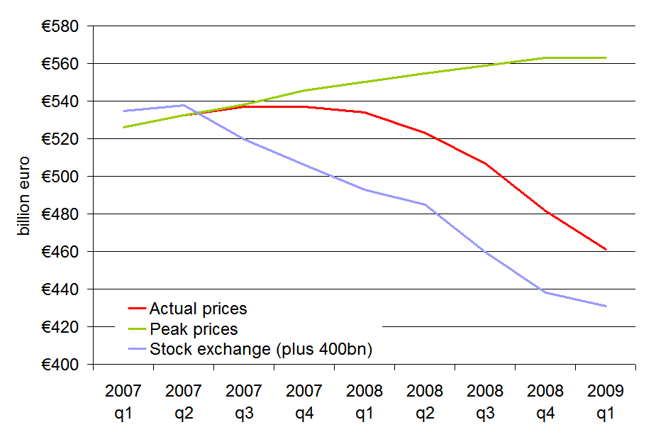
If we don’t tax property transactions, how will we tax property? And what contribution to plugging our €20bn gap can property make? Recent articles by the Sunday Independent and the Irish News of the World have discussed the scale of how much has been wiped off Ireland’s property market, while the combined report by stockbrokers Davy, Goodbody and NCB mentioned the potential revenues that could be earned by introducing a property tax in Ireland. So just how big is Ireland’s property market? The answer is about €460bn, as is shown in the graph below. The graph uses 2006 Census data on the number of households in each county, Dept of the Environment figures on new houses built in each county since 2006 and daft.ie quarterly average house prices by county.

The value of Ireland's residential property, 2007-2009

The graph also shows that the total value of Ireland’s residential property is about E100bn less than what it would be were no crash to have occurred. A similar amount has also been wiped off Ireland’s stock exchange, which is plotted on the same scale to allow comparison but whose remaining value is €30bn, compared to the €460bn still in Ireland’s homes.

Supposing the housing crash continues so that Ireland’s 1.6 million homes are worth perhaps E400bn by the time they bottom out. While well below the €600bn or so that it “could” have been, this still represents a huge potential stock of wealth that is largely untaxed. Simple maths says that a property tax that averages 1% could raise €4bn per annum. Assuming that the government will be aiming for a three-year correction to 2012 that lifts tax receipts by €10bn a year, while it cuts spending by €10bn a year over the same period, a property tax could solve 40% of Ireland’s tax woes. The average household’s annual tax bill would be less than €3,000 – or about €50 a week.

How would a property tax work? There are of course some significant issues that Ireland would have to iron out first, before a property tax could come in. For example:

  • Politically, older citizens have proved sensitive to the idea that the government might have access to some of the wealth stored in their homes, even if it’s to pay for their healthcare. The illiquidity of houses raises the prospect of retirees having to downsize to avoid tax bills. While this is normal in many places, particularly in the US, it would require a change in mindset here. Put more bluntly, the idea that people should be entitled to have any wealth stored away in property, as opposed to other forms of wealth, untouched by the government is out of date.
  • Recent purchasers would have to be given property tax credits, so that double-taxation through stamp duty and then the property tax would be avoided. Those who made particular purchases based on stamp duty arrangements that existed at the time may also feel hard done by.
  • Measurement of house prices would become even more important, as it would have tax implications. In this day and age, though, accurately measuring house prices should not be an arcane task. Measures such as the daft.ie and ESRI/ptsb series are both based on well established hedonic price methods, which could easily be adapted to official Revenue Commissioners data, if these data were made available as they are in most other countries.
  • An instant extra tax burden is probably not what the economy needs now. Phasing it in gradually over the coming 3/4 years would be advisable as it would allow adjustment to a new system, while also showing medium-term planning on the part of the government.

Nonetheless, there are significant advantages to a property tax:

  • It gives the government a steady generally acyclical revenue stream and has an automatic stabilizer effect – i.e. the tax burden households face goes down when prices slump and more than likely their confidence slumps too.
  • There is lots of potential in a property tax to achieve other goals as well as revenue-raising. (Indeed, for the purists, taxes should only be introduced when other aims will be served.) For example, the average of 1% could hide differences, if the government wanted to incentivize, for example, energy efficiency. Houses achieving carbon neutrality or some top level of energy efficiency could be exempt from property tax, or perhaps pay a minimal rate of 0.25%, while homes that incur a significant burden on the rest of society might have to pay signficantly more. (This would require significantly more planning and guidelines for consistent rating than the recent BER scheme.)

Given that we’re talking billions – perhaps even twice as much as the joint report by the main stockbrokers suggested – this should definitely be explored in more detail over the coming months.

Intergenerational outsourcing and the consequences of building 10% too much: A look at Ireland’s property market in 2013

With Davy Stockbrokers predicting a 70% fall in Irish construction activity from its peak over the coming ‘medium term’ (2009-2011 or so), I though it might be timely to review some headline statistics for Ireland’s property overhang.

Recently, I’ve been peddling the idea that between 2004 and 2007, we were building twice as many homes as we needed and building twice as many for 3/4 years implies building half as many as you need for 6/8 years to return to equilibrium. Does that stack up? Or, put another way, if we start in 2002 with Census statistics on the stock of housing, use Dept of Environment statistics for the period 2002-2008 and turn Davy’s figures into ballpark estimates for 2009-2013, how bleak will things look in five years time?

The answer, much to the chagrin of those who loathe two-armed economists, seems to be that it depends – in this instance on what part of the country you’re talking about, but also about what you think is the appropriate long-term need for new houses in this country. If we take 2001 figures (technically March 2002 figures) as our ‘departure from normality’ point, how far off course are we? Between 2002 and 2008, we churned out over half a million properties, off an existing base of just 1.3 million households. Back-of-the-envelope estimates, based on an overview of economists’ figures on this topic, suggests that we should have been building perhaps 300,000 households in that same period. (That’s using an equilibrium figure of 40,000 properties a year, rising temporarily after the accession of new EU member states.) So, enough with all the stats, what’s all this for, you wonder. Well, I was hoping to use all this to answer two key questions:

  • Where suffered worst from Ireland’s properties building bonanza? Where is housing inventory lying around most?
  • How long will we have to sit around building hardly anything until we’re back to some semblance of normality in the property market?

Where did we build our extra properties? By the end of 2008, we were about 5 years ahead of schedule – i.e. we’d built 12 years supply in just 7 years. To give a regional flavour, based on insights gleaned from the property overhang per county figures I calculated in December, I split Ireland into three regions – Dublin, Connacht/Ulster and the rest of the country. (The data allow for a full county-by-county analysis, however time constraints and poor formatting in the various external sources has prevented me from threatening another heatmap!) Over the period in question (2002-2008), more houses were built in Connacht/Ulster than there were in Dublin, which has almost twice the population! As a result, in terms of years of “pre-production”, if you will, while Dublin had under 2 years excess supply by end-2008, Connacht/Ulster had almost 8 years. Once more emphasis: builders managed to produce 15 years output in Connacht/Ulster in just 7 years.

How long will we have to sit around building nothing? It’s all very well for someone to come along after the fact and say “You shouldn’t have done that”. What’s more interesting is to shed some light on where the adjustment will come first and where it will be hardest. One option would be just to close up our construction sector for a few years until inventory shifts sufficiently and prices start to rise. Practically, of course output doesn’t and shouldn’t collapse to zero and, as per Davy’s figures, will be in the range of 10,000 to 25,000 over the coming 5 years.

Therefore, I’ve assumed output of 20k in 2009 (still slowing down), 10k in 2010 (bottom of the market) and then a simplistic 5k increase in output every year after that, rising to 25k in 2013. Let’s call this the ‘post-Section 23′ scenario. This is contrasted with a ’20:20 foresight’ scenario where steady-state output in construction remains 40,000, apart from a minor blip of 35,000 in 2009 due to global economic circumstances. In both scenarios, new houses are allocated according to a region based on its Census weight – crucially, and we can relax this later, even in our post-Section 23 world, output resumes in Connacht/Ulster, not at the distorted rates we saw but in proportion to its size. The result of all this is the chart below. The figures show the excess of properties as a percentage of the total property stock in each of the three regions.

Ireland's excess properties, % of total properties, by region, 2003-2013f

The results are pretty clear:

  • Even with some major internal restructuring of the construction industry (i.e. rebalancing output of houses according to a region’s weight in the economy), Connacht and Ulster will still have a significant property overhang, more than 10% by 2013 – and that itself based on a drastic 70% contraction in building activity from peak levels.
  • For most of the country – and indeed the country on average – the overhang will have halved by 2013 but will still be in the region of 5/6%.
  • In Dublin, shortages in housing may emerge as quickly as 2012.

Objections to the above might include one along the following lines: construction will not only contract 70% but also no-one will be building in Connacht/Ulster for years to come so even the rebalancing of output described above is not an accurate forecast. In that case, the overhang will just take the full 8 years from 2008. Section 23 and the property boom will have taken construction jobs from 2009-2015 and left them in 2002-2008 – a sort of integenerational outsourcing.

Another objection is that the optimistic (if 2012 is optimistic) scenario painted for Dublin hinges on that long-term need of 40,000 units a year (which translates into about 12,000 new units in Dublin annually, based on its Census weight). Significant and persistent net outward migration from Dublin from 2009 on – which incidentally is why I believe that Dublin Bus, so clearly an ‘inferior good’ in the economist’s sense of the word, is losing money when incomes fall – might mean that the demand for housing in the period 2009-2013 may fall to 20,000. Replacing 40,000 with 20,000, from 2009 on suggests that the average percentage overhang for the country stays stuck at 10% and Dublin – while still much lower – remains stuck at 3-4%.

In sum, we are where we are. We’ve more than enough houses everywhere in the country and plenty of houses in places where we won’t need them for another 10 years or so. Therefore, it would be wise for the Government to take this crisi-tunity, as Homer Simpson would say, to harness both supply and demand sides of the market.

  • On supply, it should focus the efforts of the much-trimmed residential construction industry, when that sector starts to medium-term plan in 2010/2011, on Dublin and other areas around the country most likely to show a shortage of property this side of 2015.
  • On demand, the Government should attempt to deliver balanced regional development, taking property overhang as an opportunity for affordable housing to create new centres of employment. Taking this to its most logical conclusion, firms outsource because they want to free up resources to specialize on what they’re good at. Therefore, we must adopt a mentality along the following lines: “Let’s take this opportunity to treat our property boom as intergenerational outsourcing, which has freed us up to focus on what we’re good at.” (Just don’t say all we’re good at is construction!)

Public Sector pay in Ireland & the €50,000 question: It’s not that difficult!

Watching Monday’s Questions & Answers, I became increasingly baffled as to how poorly understood the gap between public sector and private sector pay in Ireland actually is. I conducted a mini-straw poll, through the various media of living room chat, email and Twitter. That poll made me realise that while I had been labouring under the presumption that despite all the stats we have on wages across sectors, those stats were having no impact, others were labouring under the presumption that the debate had to be kept at a general level because we had no statistics on the topic.

The guts of a decade ago, I undertook some research for Prof. Frances Ruane on the original benchmarking deal. What we found at the time was that there was no gap emerging between public and private sector wages, or if the gap was there at all, it was in favour of public servants. For those interested in more on that 2001 perspective, I’ve embedded a version from Scribd at the very bottom of the post.

Given the way this week is going, with public sector unions somewhere between agog and apoplectic at the idea of having their wages reduced, and given that no-one in public discourse (if Q&A is representative) is quoting these figures, I thought it might be no harm to see if I could do up what we in the business call “a one-slider” that might make them understand the decision a little better.

First, a general comment about public sector pay cuts. This can’t possibly be that much of a surprise to anyone in the public sector. After all, this is what they signed up to in 2001, with benchmarking. Benchmarking may have been an incredibly expensive way to do it – costing the economy €1bn+ every year and counting – but it did establish a principle in public sector wages in Ireland. That principle is that trends in public sector wages must mirror those in the private sector. It’s incredibly cheeky of those happy to have the principle applied in the good times to argue that they shouldn’t have to ‘bear the brunt’ of having the same principle applied in the bad times.

Now for the one-slider!

Graph of public and private sector wages, Ireland, 1998-2008

And in true consultant style, three key points from the above graph:

  • Lest we forget the most obvious, in every year of the series, public sector workers were paid more per year than their private sector counterparts*. 30% more on average! (There may be perfectly legitimate reasons for this, for example average experience/years worked may be higher, responsibilities may be greater… but a priori, who knows?)
  • As you can see, the gap has widened, not narrowed over the decade. In fact, in euro terms, it widened 8 years out of 10! And after the two years of greater private sector increases (prizes for eyesight if you can spot them on the graph), there were huge increases in public sector pay the following year.
  • Public sector pay is at least five years ahead of private sector pay. What public servants earned in 2003 took their private sector counterparts until 2008 to earn (in fact, they’re not even there yet, another €500 or so to go!).

With the Live Register now rocketing towards 400,000 and private sector wages now stagnant, bonuses disappearing, total earnings in the private sector are falling. Therefore, according to the principle of benchmarking, so must public sector wages. As they are paid €50,000 on average, compared to average wages of less than €38,000 in the private sector, this won’t be the biggest economic calamity to befall Ireland this year. Now, can we please incorporate this knowledge into our social dialogue?

[scribd id=11635058 key=key-2809dv8hrkl94xxmtc5r]

* Public sector includes public administration and education, but excludes health. No data there for some reason. Private sector includes all sector apart from agriculture (again no data). Some other methodological notes: I have had to assume Q4 figures for 2008 equal to Q3 in some instances or just take the average for the first three quarters, as Q4 data are not yet out. Construction figures only start in 2004, while manufacturing/industrial wages end in 2007, so I have had to use rates of change for the remaining sectors in those time periods, but the level of wages is determined by the full sample of private non-agricultural wages.

The Humpty Dumpty threat: Will the euro fall apart?

Ricky Gervais has a very funny sketch about how ludicrous the children’s rhyme, Humpty Dumpty, is. In particular, employing horses, who don’t even have thumbs let alone opposable ones, to put him back together again. Actually, it’s so good, I’m going to embed it here:

[youtube=http://uk.youtube.com/watch?v=hYytaZ06Hco]

Anyway, spurious introduction aside, apparently according to the Financial Times (thank you irisheconomy.ie), the euro is in danger of becoming our very own Humpty Dumpty, thanks in no small part to the risks associated with Ireland (as well as Spain and Greece). The video is well worth a watch for the spreads he shows emerging for the triumvirate of risky eurozone members. He refers also to intrade prices of 30% for one country pulling out of the eurozone in the near future, which he rightly points out are amazing odds for what would seem to be such an extreme event.

And if that were to happen, would anything policymakers try to do in response to fix the euro as a viable reserve currency be just the equivalent of sending all the King’s horses to mend a broken egg? Interesting times…