Ronan Lyons | Personal Website

Blog

The first house price index based on the house price register

Over the weekend, the Sunday Independent featured some analysis I’ve done with the help of the team at Daft.ie on the Residential Property Price Register (RPPR). The full report is available here (PDF) – in this post, I’ll give a quick overview of what we did and what we found.

What is it?

The aim of the exercise was to produce a property price index for the residential market in Ireland, one based on transactions price (as per CSO but not the existing Daft.ie asking price index) and for all properties, not just mortgage-backed ones (as per the existing Daft.ie index, but not the CSO).

Many, such as NAMAWineLake, greeted the RPPR as the end to all existing property market reports but unfortunately, it’s not quite that simple. The Register certainly gives us valuable information on the number of transactions, by county and by month – and ultimately, it is volume, not value, where we will see a property market “recovery”.

The Register contains no information, however, on property type or size. Without this information, the only vaguely reliable statistic on trends in property prices is the median price. And even that is of limited use, in a market with an anaemic level of transactions, as I pointed out earlier in the month.

Luckily, where it is possible to connect up addresses in the RPPR with addresses in very large datasets of properties, such as the Daft.ie archives, then the attributes needed for a house price index – in particular location, type and size – can be added in and standard methods applied to develop a house price index for Ireland.

How was it done?

The first part of the exercise was matching up the transactions with properties in the Daft.ie archives. Fortunately – given I’ve no idea how to do this efficiently – I was not involved in this task, which was led by Paul, Head of Development at Daft. They managed to identify a property type (detached, semi-d, terraced, bungalow or apartment) for just under 20,000 transactions. Adding in information on bedrooms and bathrooms reduced the sample to about 13,500 transactions.

For these, we have all the information needed to conduct hedonic (i.e. like-for-like) analysis. How representative is this sample? The bad news is that we cannot know for certain – if we knew more about the properties excluded, we wouldn’t have to exclude them. The good news, however, is that for the main heading we do know (county), they look to be representative. The proportion of all transactions that made it in the sample for analysis varies only from 28% in Leinster (ex-Dublin) to 23% (in Connacht-Ulster), with the figure for urban areas and Munster being 25%.

The model applied breaks down each property’s price into five components: time of transaction (by quarter), regional market (six within Dublin, the other cities are each one, and each county is another regional market), number of bedrooms, number of bathrooms (relative to bedrooms) and the property type.

The full model interacts the bedroom and type variables, as well as the quarterly trend, with broad region (Dublin, Other cities, Leinster, Munster, Connacht-Ulster). This is to allow property differentials to vary around the country and also to allow the trend to vary by region. For technophiles, the method is a pooled semi-log hedonic regression. The model explains over two-thirds of the variation in house prices (the R-squared is 68.4%).

One other methodological point is warranted. The dataset is a messy one, with outliers due to errors and to extreme or unusual properties.  To combat this, a relatively standard two-step procedure is used. At the first stage, the model is run and then the model’s prediction is compared to the actual price. Where the actual price is more than twice or less than half the predicted price, clearly other factors are at work for this property. These are then excluded. It’s worth noting that the number of properties excluded by this method (roughly 7%) is below the similar proportion in the CSO index.
What did you find?

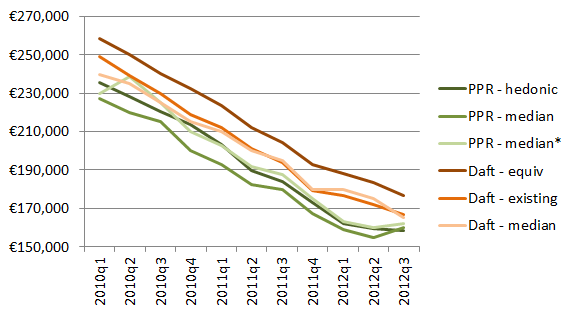
Now… on to the goodies. The first graph above shows the average property price for a number of methods. The national average is calculated with each ‘regional market’ having a weight equal to its Census 2011 share. Three datasets are used: the full RPPR (50,000 properties; median only), the subsample of the RPPR used here (13,500 properties; both median and the results from the hedonic exercise described above), and the Daft.ie listings 2010-2012 dataset (200,000 properties; the existing methodology (a variant of the above), the methodology described above applied to this dataset; and the median).

There are a couple of points worth noting. Firstly, while the two median series based on RPPR data point to a small increase in prices in Q3 2012, this increase disappears using the like-for-like method (as I suggested it might). Secondly, the average price in all three Daft.ie series is above that in all three RPPR series, and this is especially the case when the model described above is applied to Daft.ie listings. This suggests that in general asking prices are 10% above transaction prices. (This latter fact is probably due to the fact the full Daft.ie listings model can include a variety of sub-county controls, something the limited transactions in the RPPR cannot do.)
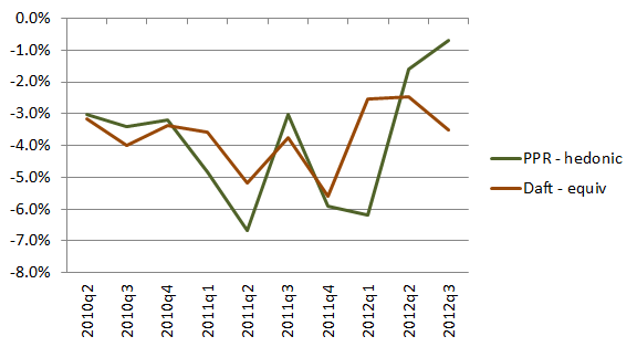
The second graph (above) shows the quarter-on-quarter change in RPPR transactions and in property listings. Again, I took two things from this graph. The first is that by and large, they tell the same story – when list prices fell more sharply, so too did transaction prices. The difference at the end is certainly not typical and perhaps more noteworthy for that.

Secondly, both series point to much tougher market conditions in 2011 than in either 2010 or 2012. The average quarterly fall in prices in 2011 was 5.1% (in the RPPR series, 4.5% in list prices), compared to 3% before/after. Put another way, prices in 2012 Q3 were just 2.3% lower than in Q1, whereas twelve months previously they had fallen 10% in the same period. (For reference, they fell by 6.3% during the same period in 2010.)

The Daft.ie RPPR index is shown in the table below, alongside the existing Daft.ie asking price index and the CSO index, each of which has been rebased so that the average for 2010 is set to 100. The correlation between the RPPR index and the CSO index is 99.8%, while the correlation with the Daft.ie asking price index is 99.7%.

So what?

Those whose time is tight might be wondering what’s new in all this. In one sense, there’s not an awful lot of “new news” in this. Prices are close to stable but are falling gently still… but not at anything like the speed we saw in 2011 – “but sure we knew that from the CSO and Daft.ie reports anyway”.

The value in adding an RPPR index (as the Daft.ie Report will hopefully be doing from now on) is not that it will reveal necessarily anything hugely different from other sources. Rather, it is another signal from the market and together all these signals will paint a picture. This will come as a disappointment both to those hoping prices had actually been rising secretly and to those hoping they’d been falling sharply still. But to the rest of us, the fact that all market signals are saying roughly the same thing is welcome news: it will make it all the easier to know when the property crash is over.
Reports of our death are greatly exaggerated: existing house price reports respond

There now follows a statement from Continuity EPR (Existing Property Reports), which was delivered to me anonymously in the dark of night.

Hello. We are Continuity EPR. We represent existing property price reports. We would like to respond to NAMAWineLake’s recent obituary for us. We are not dead… Indeed nothing could be further from the truth!

It was very certainly interesting and rewarding to read NAMAWineLake’s assessment of our contribution over the last few years. However, NAMAWineLake – while incredibly strong on the legal and journalistic side of things – seems to be unaware of the economics and statistics that underpin solid property market reports like ours.

Take, for instance, this quotation “With the launch yesterday of a property price register in Ireland, we are now close to drawing a line under the relevance of the … indices which prevailed for so long” – which is quickly followed by a less than charitable “Good Riddance!”. There are three core reasons that, like us or lump us, existing property price reports are not only not dead but every bit as relevant now as they ever have been.

A register, not an index

Firstly, the new Property Price Register is not an index and not designed to be one. It is a register. As merrionstreet.com notes, “It is important to note that the Register is not intended as a ‘Property Price Index’. The details made available on the property register are limited to price, address and date of sale and do not include such details as property size or number of rooms.”

A NAMAWineLake partisan might say that it doesn’t matter and we can use averages or standard deviations or some such to throw off the shackles of existing indices and embrace the new register. As star economist and all-round nice guy Ronan Lyons has already outlined, even using something that sounds sensible like the median, which is unlikely to be skewed by errors or outliers is fraught with issues of interpretation and confidence.

Does anyone reading this believe that prices in Dublin rose 14% in the third quarter? That is what the PPR median would have you believe!

Quantity as well as quality

“But,” the NAMAWineLake fundamentalists cry, “surely someone somewhere will do something!” They write: “by January 2012 there should be some entrepreneurial move to create an index based on settled prices”.

It’s funny that they should mention this, because who will be best placed to compile such an index? That’s right, those already familiar with the data pitfalls and methodologies required. Unfortunately for NAMAWineLake, they may find that come January 2013, rather than celebrate the demise of existing reports, they are forced to report an expanded set of statistics from them.

Even aside from issues of individual errors, there is a major drawback associated with the Property Price Register in current market conditions. That drawback is volume. The greater the volume, the more reliable the findings from a rigorous property market report.

With just 400 transactions this year so far in all of Connacht and Ulster excluding Galway city, it will not be possible for even the best data wizards to ensure inclusion of structural differences in house prices between, say, the coastline north of Sligo town and the coastline west of it. This is something that at least one member of Continuity EPR, the Daft.ie Report, does every quarter, while another of our group, the CSO Index, can currently only compile indices for Dublin and the rest of the country.

So the quantity is there – while NAMAWineLake themselves argue that the quality is going to get better. Preliminary figures suggest a 96% correlation between asking prices and closing prices – more of that anon – but that may get even better. NAMAWineLake writes, remarkably in our very own obituary: “as a result of the transparency revealed in the property price register[,] asking prices should be more realistic… and buyer/seller expectations should be more closely matched.”

Remember 2006!

“But,” a NAMAWineLake fundamentalist might cry, “surely at some point in the future this problem will go away!” And indeed, it is presumably a question of when, rather than if, the volume of property sales is roughly similar to the volume of property listings. Surely then, we become defunct?

Cast your minds back to the second quarter of 2006. Ireland was getting ready for yet another Celtic Tiger summer and the ESRI-PTSB report showed annual house price growth of 16%, up from 13% in the first quarter. Yet along came the Daft.ie Report, which showed annual growth in asking prices slowing dramatically, from 14% in early 2006 to 6% in mid-2006. Indeed, it showed no change in effectively no change in asking prices between late 2005 and mid-2006.

It happened again in early 2007, when transactions-based measures showed house prices rising but the Sunday Times led with “Ireland’s Property Market R.I.P.”, based on the latest Daft.ie Report.

The point is: we did not come into existence because there was no other measure of house prices. The Department of the Environment produced an average house price series for decades before we came along. And throughout the last ten years, there has been either the ESRI-PTSB (a former member of our group) or the CSO index (a current member) tracking prices based on transactions.

The key point is that asking prices capture sellers’ expectations and this is generally a lead indicator for the market. The importance of indices based on asking prices will probably increase, rather than diminish, as Ireland (eventually) heads back into its next real estate boom.

Different Strokes

So, if we are so good, why do we vary so much? Why, every quarter, do the CSO, Daft.ie and myhome indices show different quarter-on-quarter percentages?

The first thing is to take a step back. Have a look at these indices from 2006 to now. Are they really telling vastly different stories? Not at all. Journalists would be well served by focusing less on the quarter-on-quarter changes and more on the bigger picture, such as annual or from-peak changes.

But why specifically do they vary from quarter to quarter? Remember that none of these metrics is equivalent. None of them are meant to be the same. They all use roughly the same methodology (hedonic regressions) but on different datasets. The CSO dataset uses all mortgage transactions, the two limitations being it cannot include cash transactions and that it is lagged by the length of time it takes between agreeing a price and drawing the mortgage down officially, which is typically at least a month. (Note that the Property Price Register also suffers from this timeliness drawback!)

The myhome index is based on a snapshot of all properties on the market at any one time. It captures a mix of past and present expectations on the part of sellers. The drawbacks here are its limited market share, especially outside Dublin, and the consequence of its design, i.e. that a property whose list price was set in 2009 but is still on the market is given the same weight as one whose price was set yesterday.

The daft.ie index uses only those properties newly listed or that have changed their price in a particular quarter. This leaves rich datasets – as many in one quarter on average as there are transactions in total in the Property Price Register from the start of 2010 – but excludes all but the most recently set expectations.

We look forward to NAMAWineLake’s extended coverage of our reports come January and forgive them for their premature obituary!

Regards,

P.R. O’Perty, Continuity EPR.


First results from the property price register – the IMF effect and rising prices?

As I mentioned in my earlier post today, Ireland has –at long long last – a public property price register. I also mentioned that it is a tricky business to extract any meaningful signals about the market as a whole from a database that has no structured information about location (other than county), never mind the property’s attributes, such as size, type, number of bedrooms, bathrooms, etc.

“Tricky” is not the same as “impossible”, though, so in this post, I’ve assembled a few facts and figures about the market, based on the 50,000 market-price transactions that have taken place since January 1 2010.

The IMF effect

The key use of the property price register, when talking about analysing the market as a whole, is the information it contains on the volume of transactions. The picture that emerges is a tale of two halves. The first half is the what happened in 2011 compared to 2010, the IMF effect as the economy in general and property market in particular adjusted to life in bail-out Ireland.

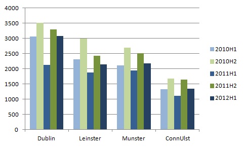
The impact on volumes was clear. The number of transactions in the first half of 2011, at just over 7,000, was 20% lower than the same period in 2010, when it was just over 8,800. Dublin in particular was hard hit by the uncertainty, with the number of transactions down 31%, from 3,100 to 2,100.

The first half of 2012 has been a period of regaining lost ground, with the total for the six months to June 2012 of 8,740 very close to the 8,800 two years previously. Dublin has been driving the higher volume of transactions, with over half of the extra 1,700 transactions occurring in the capital, but in general the increases in 2012 just offset the losses of 2011.

An overview of the volume of transactions by broad region is shown in the graph below.

Trading volume, by regional property market, 2010-2012

A first look at prices

Using a property price register to say anything at all about what has happened prices in the market as a whole is a game fraught with dangers. The most solid statistic is the median (or typical) price, i.e. the one with as many transactions cheaper than it as more expensive. It is quite different to the mean (or average) price, which will be skewed if one property sells for €100m, compared to €10m.

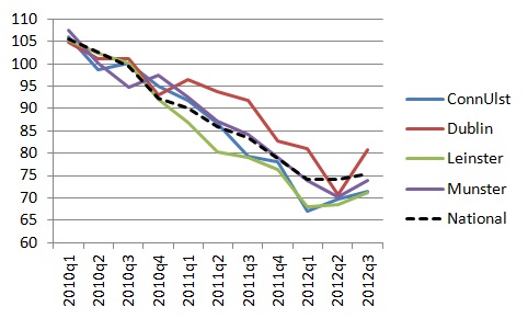
The picture that emerges is one probably far removed from the expectations of conspiratorial types who believed that everyone from the CSO to myself was involved in over-stating (or fabricating) a recovery in the property market. If anything, recent reports have understated the extent to which prices have stabilised. The first graph below shows the median price per region per quarter. The stability since the start of the year is notable, particularly when contrasted with free-falling prices in 2011. Also notable – with the exception of Q2 2012 – is the much smaller rate of decline in prices in Dublin than in other regions of the country. Since 2010, prices are down 20% in Dublin but 30% elsewhere.

House prices by region, 2010Q1-2012Q3 (2010=100)

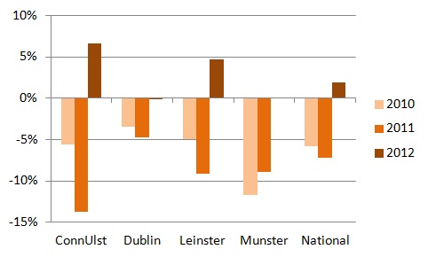
The second graph below condenses this change in conditions since the start of the year. It shows the percentage change in median price between Q3 and Q1, for 2010, 2011 and 2012. Conditions worsened in 2011, with the national median price falling 7% between Q1 and Q3 2011, compared to 6% 12 months previously. By contrast, median prices have risen by 2% between Q1 and Q3 2012. Do not adjust your sets: yes, I wrote “prices have risen”!

Change in prices, Q3 over Q1, by region (2010-2012)

What next?

Suspicious types should be asking themselves why I chose the rate of change between Q1 and Q3, rather than the more obvious Q2 to Q3. Using Q2 instead would suggest a 14% increase in Dublin prices in just three months. Would anyone believe me if I said that?

That highlights the limitations to using the property price register for any sort of price analysis, even the (hopefully) careful median price analysis I’ve done above. The reason why a median price might shift 14% in just three months relates to the limitations of the data: we know nothing about the attributes of the properties in question. So maybe 3-beds formed a bigger chunk of the Q2 market while there were more 4-beds in Q3. Or perhaps conditions improved in South Dublin, and it formed a much bigger chunk in Q3 than in Q2. Ultimately we just don’t know.

It seems such a shame that having all this transaction price information out there, we can’t undertake any meaningful analysis of trends in prices… yet. I’m working with the tech guys at Daft and we’re hoping to match up addresses of property listings and property transactions. That way, we would know lots more about the properties sold, such as exact location, property type, and number of bedrooms and bathrooms. While this would inevitably be just a proportion of all transactions, and a small fraction of all listings, it would still allow the calculation of a substantive mix-adjusted price index of transactions, which would be a companion to the already existing asking price index.

Wish us luck!

Three tips for using Ireland’s property price register

At long long last, Ireland has a property price register! The site went live hours before the revised deadline (end of Q3 2012), and there will hopefully be time in future to quibble about how it took so long for what seems to be no more than “export to .csv” – particularly given how much extra had been done by private citizens, by the time I went to bed less than 12 hours after its launch, from rival sites to apps.

Nonetheless, we should take the opportunity to bask in this wonderful new service available to individuals and households active in the property market. With all the excitement, I thought I might offer three tips for researchers, from someone who spends an unhealthy amount of time with property market data, as I see from thepropertypin and other places that plenty are starting to do their own number-crunching.

Individual analysis, not market analysis

The first tip would be to remind people that the primary contribution of the register is in relation to individual transactions, not market-level analysis. What I mean by this is that someone thinking of buying a property has an area, village or street in mind, and with this tool, they can go on and – using their knowledge of particular properties, including things like size, condition, aspect, etc. – see what prices are like nearby.

The volume of sales

Nonetheless, people will be determined to divine some signals about the market as a whole from the register as currently constituted. So, when it comes to market-level analysis, the only really cast-iron contribution of the register is sales volumes. The register tells you how many properties were sold by month for each county. It is clear that there will be variability in individual county-month pairings, so my own recommendation would be to focus on quarterly data at the provincial level (counting Dublin as its own province).

What about prices?

Ultimately, though, people want to talk about prices, which I get. If you must talk about prices, best to talk about median prices (=MEDIAN in Excel), or perhaps the other quartiles such as 25th and 75th percentiles (one quarter and three quarters the way through the price distribution).

What I am stressing, though, is to avoid talking about mean prices (=AVERAGE in Excel). Even with median prices, the data are going to get dragged this way and that by the mix of locations and types of properties sold in any given quarter, which is why even median prices have greater health warnings than – believe it or not – hedonic or mix-adjusted prices such as the CSO and daft.ie series.

Mean prices (what we think of when we typically think of averages) will be affected not only by that but also by extreme values and in particular errors in data entry by solicitors, which are not infrequent (having spent a lot of time yesterday wrestling with the data). For example, one property in Limerick sold for €127m [I’m guessing €127,000 is its true price] while others in “leafy” parts of Dublin sold for mere thousands [not hundreds of thousands].

So, use with caution as a market research tool. This is not a substitute for a rigorous index of house prices and, like it or lump it, indices such as the CSO and Daft.ie remain far better tools to analyse price trends in the market as a whole. But that should not take away from the main point, i.e. that this is an absolutely essential tool for those looking to buy and sell. Happy nosy-parkering!

Parsing free comment to see its value – Charles Eisenstein in the dock

In The Guardian’s “Comment is free” section, Charles Eisenstein writes about a number of “big ticket” items, including economic growth, the use of monetary policy to solve the current economic crisis and fractional reserve banking. I think it’s worth going through the piece bit by bit, to parse the good ideas from the less well thought out ones. He starts:

Federal Reserve chairman Ben Bernanke’s pledge at Jackson Hole last Friday to “promote a stronger economic recovery” through “additional policy accommodation” has drawn criticism from economists, liberal and conservative, who question whether the Fed has the wherewithal to stimulate economic growth. What we actually need is more spending, say the liberals. No, less spending, say the conservatives. But underneath these disagreements lies an unexamined agreement, a common assumption that no mainstream economist or policy-maker ever questions: that the purpose of economic policy is to stimulate growth.

So far, so good – since probably the 1700s and certainly the 1800s, people have come to expect progress, i.e. that the quality of life that their children enjoy is better than theirs. Economic policy is all about growth because no-one has ever won an election telling the voters he would actively prevent their children from having a better standard of living.

So ubiquitous is the equation of growth with prosperity that few people ever pause to consider it. What does economic growth actually mean? It means more consumption – and consumption of a specific kind: more consumption of goods and services that are exchanged for money. That means that if people stop caring for their own children and instead pay for childcare, the economy grows. The same if people stop cooking for themselves and purchase restaurant takeaways instead.

These are not insights. This is, to put it mildly, very basic economics – a discussion of what GDP does and does not include constituted a good chunk of the very first topic for my first-year undergraduates this year. There is general unease among economists about using GDP per capita to measure the true level of welfare. Including the value of the various “imputed services” we get, from looking after our own children to walking in the park, is very important, especially for the allocation of public resources. Having said that, economists probably also acknowledge implicitly that the main impact of such an inclusion would be a one-off shift in the calculation of welfare. The level may be off but the trend is probably not.

Economists say this is a good thing. After all, you wouldn’t pay for childcare or takeaway food if it weren’t of benefit to you, right? So, the more things people are paying for, the more benefits are being had. Besides, it is more efficient for one daycare centre to handle 30 children than for each family to do it themselves. That’s why we are all so much richer, happier and less busy than we were a generation ago. Right?

No modern economist would argue that richer axiomatically means happier, although I’m open to correction. What economists, politicians and voters do seem to agree on, however, is that greater material prosperity is associated with greater life satisfaction. From freedom from an ever greater array of diseases and medical conditions to the capacity to fulfil one’s potential in jobs that didn’t exist 10 or 100 years ago, voters want growth.

Obviously, it isn’t true that the more we buy, the happier we are. Endless growth means endlessly increasing production and endlessly increasing consumption. Social critics have for a long time pointed out the resulting hollowness carried by that thesis. Furthermore, it is becoming increasingly apparent that infinite growth is impossible on a finite planet. Why, then, are liberals and conservatives alike so fervent in their pursuit of growth?

To the question at the end of the paragraph first, it’s because that’s what people (i.e. voters) want! The key point in this paragraph, however, is the point about infinite growth on a finite planet. Almost all those making this point currently are right but for the wrong reasons. That is because they talk in terms of consuming resources without understanding the huge economic transformation that has occurred in the last fifty years. They are wrong because increasingly our standard of living is determined by services, which are experiential , and not merchandise, which are resource-intensive. Services now account for four-fifths of all economic activity and this share is growing decade after decade.

Because experiences do not need resources per se, it’s certainly possible to consider a world economy two or three centuries from now where the standard of living is a multiple of ours today. It is estimated that, accounting for inflation, per-capita income has increased ten-fold in the last two centuries. This could easily happen again over the next two centuries. But it can’t go on for ever. At some point, maybe in the year 3,000 A.D., or 30,000 A.D., or 300,000 A.D., the trend is going to slow to zero, as the standard of living is high enough to be, from this distance, close enough to infinity.

The reason is that our present money system can only function in a growing economy. Money is created as interest-bearing debt: it only comes into being when someone promises to pay back even more of it. Therefore, there is always more debt than there is money. In a growth economy that is not a problem, because new money (and new debt) is constantly lent into existence so that existing debt can be repaid. But when growth slows, good lending opportunities become scarce. Indebtedness rises faster than income, debt service becomes more difficult, bankruptcies and layoffs rise.

I’m not sure if anyone truly understands the money system but it seems clear to me that Charles definitely doesn’t. Money is a form of wealth, in particular it is wealth turned liquid, so that it can be used as a medium of exchange. It does not exist separate to wealth. People lend because they have excess resources, based on what they consume today versus in the future. Others borrow because they need to invest to create more income and wealth for themselves in the future. The arguments about debt and money made above seem, to me, to be effectively saying that there is a limit to the wealth we can create. Which takes us back to the experience-economy and the year 30,000 A.D.!

Central banks used to have a solution for that. When growth slowed, they would simply buy securities (usually government bonds) on the open market, driving down interest rates. Investors who wouldn’t lend into the economy if they could get 8% on a risk-free bond might change their minds if the rate were only 5%, or 2%. Rates that low would stimulate a flood of credit, jumpstarting the economy. Today that tool isn’t working, but central banks are still trying it nonetheless. With risk-free interest rates near zero, they continue creating money through the same means as before, now calling it “quantitative easing”. The thinking seems to be: “If you have more money than you know what to do with and are afraid to lend it, how about giving you even more money?” It is like giving a miser an extra bag of gold in hopes that he’ll start sharing it.

Most commentators interpret Bernanke’s remarks as signalling the possibility of a new round of quantitative easing. If so, the results will likely be the same as before – a brief churning of equities and commodities markets, but little leakage of the new money into the real economy. In all fairness, we cannot blame the banks for their reluctance to lend. Why would they lend to maxed-out borrowers in the face of economic stagnation? It would be convenient to blame banker greed; unfortunately, the problem goes much deeper than that.

There is the nub of a point here, but again one that is well-known to economists and to policymakers, i.e. the liquidity trap. This comes back to what money is. What I taught my first-year undergrads was that money was effectively the currency of confidence. Generally, some want to save while others want to borrow. If times get bad, though, and confidence is low, everyone wants to save while no-one wants to borrow. Not only that, there may be a few out there who do want to borrow but confidence is low enough that banks don’t think they’ll get their money back. The reason this is a trap is because you can’t manufacture confidence. You can use your standard toolkit but ultimately it may not work.

The problem that we are seemingly unable to countenance is the end of growth. Today’s system is predicated on the progressive conversion of nature into products, people into consumers, cultures into markets and time into money. We could perhaps extend that growth for a few more years by fracking, deep-sea oil drilling, deforestation, land grabs from indigenous people and so on, but only at a higher and higher cost to future generations. Sooner or later – hopefully sooner – we will have to transition towards a steady-state or degrowth economy.

There is a massive leap of logic here (the term logic used loosely): “Monetary policy is currently ineffectual because confidence is low… thus economic growth will have to stop.” The only connection between the two is the rather flimsy argument that money and debt are out of sync. Throwing in emotive terms like fracking, deforestation and land grabs from indigenous people is not only a cheap rhetorical device – it also shows Eisenstein’s equation of prosperity with resources. This is increasingly not the case. (Compare the natural resources Zuckerburg has bespoiled with those of his 19th century equivalents.)

Does that sound scary? Today it is: degrowth means recession, with its unemployment, inequality and desperation. But it need not be that way. Unemployment could translate into greater leisure for all. Lower consumption could translate into reclaiming life from money, reskilling, reconnecting, sharing.

This is unbelievably naïve. Unemployment is probably the single biggest destroyer of personal life satisfaction there is (maybe some behavioural economists can back me up here). The reason that a society like France looks like it’s creaking under the strain is not because everyone is working too much – it is because the young do not have enough work. I do believe personally that the US has got the balance between work and leisure wrong. I value my leisure time quite highly as ultimately time is our true finite currency (not money). But that is not for a minute to say that I think we could somehow cut the standard of living and divvy up the jobs so that everyone works 25 hours a week.

Central banks could play a role in this transition. For example, what if quantitative easing were combined with debt forgiveness? The banks get bailout after bailout – what about the rest of us? The Fed could purchase student loans, mortgages or consumer debt and, by fiat, reduce interest rates on those loans to zero, or even reduce principal. That would liberate millions from the debt chase, while freeing up purchasing power for those who are truly underconsuming.

Again, this seems to miss a key point: banks are not massive cash hoarders in and of themselves. They are intermediaries between savers and borrowers. “The banks get bailout after bailout” is not accurate: it is savers that are getting the bailouts (bailouts here meaning they get paid back in full). Debt forgiveness is not some low-hanging fruit out there, pleading to be plucked. It is a transfer from savers (typically the old) to borrowers (typically the young). We can certainly do this if we want but we should be under no illusions that this represents some sort of painless victory.

More radically, central banks should be allowed to breach the “zero lower bound” that has rendered monetary policy impotent today. If investors are unwilling to lend even when risk-free return on investment is 0%, why not reduce that to -2%, even -5%? Implemented as a liquidity tax on bank reserves, it would allow credit to circulate in the absence of economic growth, forming the monetary foundation of a steady-state economy where leisure and ecological health grow instead of consumption.

Some central banks have done this but it is likely that any concerted effort by major central banks to introduce negative interest rates would see a flood of money to other financial institutions, even if they were just offering zero. “Under the mattress” is one such institution.

One thing is clear: we are at the end of an era. No one seriously believes that we will grow ourselves out of debt again. There is an alternative. It is time to begin the transition to a steady-state economy.

This appear to be either taken from a different article completely or else meant to blind the reader with statements so big they’ll overlook the relatively ordinary analysis that preceded them!

There are plenty of problems with modern economic policy that Charles could have chosen to focus on. It is certainly possible that the days of 2% trend growth are over. But we’ll need far better analysis than this to show us the way!

Property tax – it’s not rocket science!

Ireland’s struggle to introduce a property tax continues, as does the public’s fixation with it. A minor bullet point in this update to the IMF-EU “troika”, confirming what was already decided – that Ireland is going to bring in a value-based property tax – is (along with that other staple of Irish debate, abortion) leading the news this morning.

The on-going poor quality of information doing the rounds is a big frustration so I’ve decided to continue my crusade for good policymaking in Ireland and post (yet again for long-standing readers) about property tax.

Why a property tax at all?

The yawning gap between what the Irish government takes in and what it spends means that both spending cuts and new tax revenues are needed in coming years. Comparing Ireland’s tax structure with other countries, the country already has among the highest marginal rates of direct (income) and indirect (VAT) tax in the world. What’s missing? Well, the third type of tax, after direct and indirect, is wealth tax.

And real estate comprises the bulk of wealth – not just in Ireland, but everywhere. Ireland’s homes are collectively worth roughly €300bn – a huge chunk of our balance sheet. What’s missing, when you compare Ireland with other developed economies, is a property tax. Those who argue against property tax are not taking a principled stand against bank bailouts. They are arguing for even higher income or consumption taxes. And thus missing the chance to tax wealthy non-residents who own property in this country.

What is a value-based property tax?

Ultimately, I’m not sure why the Government is making a mountain out of a molehill. There are basically four types of property tax out there – flat charges, bands, full value and site value – and they are fairly easy to rank. The worst kind of property tax is the flat charge, what was introduced here earlier this year. It is obviously regressive and unfair and is also just a temporary measure so little more needs to be said about it.

The next worst type of property tax is the bands system. Under such a system, if your property falls under certain thresholds, it benefits from a lower tax rate than others. This is similar to how stamp duty used to work in Ireland. It is also how council tax works in the UK. Until this morning, I hadn’t heard anyone argue in favour of it, although there had been some mumblings in newspaper reports – this morning, though, Fergal O’Rourke of PWC actually called for a bands system.

What has happened in the UK should be a salutary lesson for Irish policymakers. Bands means trouble because in any given year people want to be under the threshold, thus distorting prices, while over time unless bands change every year, they become ridiculously outdated. So in England, your property tax is based on what the value was in 1991, not today, because no-one can agree on updating them. Even aside from our preferences having changed over the last generation, this is plainly bad policymaking. Why anyone, least of all a tax expert, could think is a runner at all is a mystery!

Should we pay relative to the market value?

An improvement on bands is a full value tax – you pay a percentage of what your property is worth every year. Those with more property wealth pay more in property tax. Straight away, some of the dodgy side-effects of a bands system are overcome. If property prices rise or fall, you don’t have to worry about political will to update bands. However, a moment’s thought should point out some pretty weird features of a full-value property tax.

For example, the Minister for the Environment is a big fan of regenerating town centres, which have fallen victim to edge-of-town retail centres in recent years. However, under a full-value tax, the owner of a derelict city-centre site has no incentive to redevelop it because if he does, he’s faced with a higher property tax bill. What sounds like an issue for developers also affects households. If you make your home more energy efficient, up goes your annual property tax bill. New extension? Up goes the bill. Anything at all that involves you using scarce land in socially more useful ways is punished.

This is the major theoretical problem with full value tax: the last thing you want is for your tax system to punish those who use a scarce resource well. And then in practice, there are huge issues of implementation. Is that extra room upstairs a bedroom or a study? (Each will have a different price.) Is that attic properly converted? Is that outhouse part of the main building? All of these are prices that have to be measured and updated, creating lots of work for people like me but ultimately very little use to the taxpayer.

What is “site value” and why should we tax it?

The fairest form of property tax is the site value tax. This is not as complicated as some try to make it out. The value of your property has two components: the land and what you put on the land. Subtract the latter from the total value and you have site value. How might we measure the value of land around the country? Happily, it’s already been done and is available free of charge from smarttaxes.org. There’s even a map outlining the contours of site values in the country. Pages 14-16 of that report also go through options in relation to those on low incomes and those in negative equity, as well as a number of other issues.

There are many arguments in favour of site value tax and few against. It rewards, rather than punishes, households that make their home more energy efficient. At a deep level, site value tax is inherently fair – after all, why is land worth more in some places than in others? It is because society and nature – not individuals – have created amenities that people value and pay for. Is it too much to ask people to pay back a small part of the benefit they are getting from society? Site value tax is also really handy because it can be applied to all types of land, residential, commercial, public and agricultural land, with huge beneficial side-effects in terms of land use and – dare we say it – economic recovery.

Site value tax is also a tax on hoarding land and speculating, as residential land banks on the edges of towns would incur the same as developed estates. This also removes the incentive for people to get their land banks zoned residential on the off chance they could become millionaires. If it’s zoned residential, use it as residential or pay the price!

According to media reports, the Government is currently of the opinion that a site value tax “would throw up anomalies” such as a rundown property and a modern property on similar sites having the same property tax bill. That is not an anomaly. That is the tax system encouraging us all to use as well as possible a scarce and valuable resource, i.e. land.

I agree that a property tax should be easy to understand. A range of bands and tax rates creates a complicated system that people want to game. That is only one consideration, however. After all, it is very easy to understand a €100 household charge but that was hardly publicly accepted. A simple flat site value tax rate is well within the grasp of a population that frequently votes in referenda on constitutional and foreign policy issues.

What do other countries do?

One of the oddest arguments I have heard yet against the site value tax is “no-one else is doing it”. Even if it were true, what an odd argument! In-built bias towards the status quo means that most countries are stuck with property taxes very similar to what they had fifty or a hundred years ago. Ireland – by dint of auction politics since the 1970s – is in the oddly lucky place of being able to choose the best system without the constraints of status quo.

But even then, it is not true to say that no-one uses site value tax. There are numerous states and cities around the world, from South-East Asia to North America, that have it. Two other small open economies in the EU – Denmark and Estonia – use site value tax consistently and successfully. Rather than ape the failed system of our nearest neighbour, perhaps we could take a leaf out of their book instead.

The lack of a property tax means we have the opportunity. With Land Registry records on who owns what site where, as well as existing research on the contours of land value around the country, we have the means. And with the positive side effects that only a site value tax can bring, we have plenty of motive. Hopefully our Government won’t let us down.

The post above is based on an op-ed piece I wrote in the Sunday Business Post earlier in the month.

Ireland’s two-speed rental market

The latest Daft Report was released yesterday – all the materials are available from the usual place, including a commentary by John Logue, the new president of the Union of Students in Ireland, and the full report itself (PDF), which includes the annual “Student Special” of rates close to all Ireland’s major higher education institutions. There are two main headlines, at least by my reading: one in relation to rental trends and the other in relation to the number of properties on the market.

In relation to average rents, it remains hard to describe the national rental market with just one statistic. Rents have been higher (in year-on-year terms) in Dublin and Cork every quarter since the start of 2011 (the last six quarters). On the other hand, outside Ireland’s cities, rents have been falling consistently in year-on-year terms since early 2008.

It should be noted that the rate of change in both cases is small – up typically less than 2% in Dublin and Cork, down roughly 3% outside the cities. Nonetheless, as each quarter adds to the last, the split becomes more and more apparent and something a few of us predicted would happen in late 2009/early 2010 looks to have come to pass. (For those wondering about Ireland’s other three cities, Galway city is a bit of intermediate case – rents have effectively been static the last six quarters. Limerick and Waterford are closer to the non-city areas than to Dublin and Cork in their performance.)

Rental supply

In relation to the supply of rental properties, the number of rental properties on the market continues to fall – and this is again driven by Dublin. On August 1st 2012, there were 16,500 properties on the market available to rent, down from almost 19,000 on the same day in 2011 and over 23,000 in 2009. While this is still well above the 7,000 or so rental properties on the daft.ie site in mid-2007, I think comparisons with 2007 miss two important facts: the rental market outside cities was much more limited while there were free capital gains to be had in real estate; and secondly, the delay in people buying property means that there are more renters than a “business as usual” scenario.

In Dublin, there were 4,200 rental properties on the market at the start of August this compared to 5,400 last year and 6,500 two years ago. As someone who was actively on the market last summer, the market was by no means over-stocked then – so market conditions will be tight for those looking to rent in prime locations, even as conditions remain firmly pro-tenant in many counties. There is less than one month’s supply on the market at any one time in Dublin now, compared to two months in Connacht-Ulster.

A case of urban economics

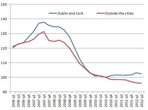
Returning to the first point, though, the difference between Dublin and Cork in particular on the one hand and the non-urban areas of the country on the other is increasingly striking. The graph below shows the performance of the two segments over the last two years (since 2010-Q3) as well as giving the context of what happened 2006-2010.

Rents in Dublin and Cork compared to the non-city areas, 2006-2012 (2010Q3=100)

The fall from the peak to 2010-Q3 was certainly larger in Dublin and Cork… but the falls elsewhere since then reverse this conclusion. Rents in Cork and Dublin are now on average 25.5% below their 2007/08 peak, while the falls in the “Rest-of-Country” segment (i.e. outside the five main cities) is now 27%.

This is probably mostly a case of common sense: people move to cities because they are the best job creators. The “labour market amenity”, as urban economists such as myself might call it, has perhaps strongest appeal when jobs are tight. Given no significant oversupply of rental properties in either of Ireland’s main cities, and given willingness-to-move to the cities from elsewhere in the country by Ireland’s young workers, it’s unlikely there’ll be any reversal of the trend any time soon.

The price of freedom, the power of narratives – thoughts on the Parnell Summer School

Earlier in the week, I posted an overview of my talk at this year’s Parnell Summer School, where the theme is Sovereignty & Society, in recognition of the 100th anniversary of the Home Rule Bill. I mentioned towards the end that following my address, there was a panel discussion on Ireland’s economic sovereignty, involving Richard Boyd Barrett (the People Before Profit TD), Paul Murphy (the Socialist Party MEP), Brendan Butler (of IBEC) and Pascal Donoghue (of Fine Gael).

The discussion was in reality four rather separate speeches, each of about 25 minutes in length, followed by audience Q&A. Given their backgrounds, however, the speeches by Boyd Barrett and by Murphy were quite similar in nature. When listening to both, it struck me that – whatever about TV debates, particularly when it comes to elections – there is no sense in trying to engage on particular points. If you disagree, it has to be a disagreement at a fundamental level, the level of the entire narrative. This is not a criticism of either contributor – they are both excellent speakers. In fact, it is a testament to the completeness of their narrative that really means the only fruitful engagement will come from going all the way back to basics.

The Socialist Narrative

I will do my best to sum up the Boyd Barrett-Murphy argument: they believe that the economic crisis that started in 2007 is being used as an opportunity by a global elite in control, who share a common ideology, to embed that ideology permanently and beyond the reach of citizens, i.e. anti-democratically. To them, the global elite’s “neoliberal” ideology is summed up by capitalism, privatisation, deregulation and the market. (By the by, I’ve never understood what was precisely so ominous about being a latter day liberal, other than the tone in which it is used by those who have set themselves against neo-liberals!)

According to the narrative, this elite that is in commanding control is pro-market, pro-1% (i.e. themselves presumably) and anti-worker, hence they are trying to reduce minimum work standards and similar, and impose austerity so that the “ordinary man” pays the cost of them enjoying greater wealth. In that context, the EU’s new fiscal “six-pack” is interpreted easily – as a way for the elite to put their ideology irreversibly beyond democratic control.

Paul Murphy, who spoke second of the two, explain in more detail that the root problem is profit. When the profit motive is king, it tramples on people, according to him – why else would EU companies be sitting on €3,000 billion of cash reserves while there are tens of millions unemployed across the EU?

A complete story is not necessarily a true one…

Listening to both men speak, they are compelling public speakers and likely to tap into public anger. They are likely in the next election to have success with those who believe that it is banks, not deficits, that are the bulk of what’s wrong with Ireland’s problems right now. If you try and tackle one point that they make, their answer will most likely be something that is entirely consistent within their narrative – and leaves the questioner having to go one step further back.

Ultimately, the 21st century’s socialists view of the world, if Boyd-Barrett and Murphy are representative, comes down to control. Socialist or not, we all have to answer the question: why are there so many things wrong in the world right now? From first-world problems like falling birth rates, pension shortfalls and youth unemployment to more pernicious issues ravaging developing countries, the world is not as any of us would like – and any account of the world has to incorporate the economic crisis of the last five years. And it comes down to whether you believe in incompetence or malevolence.

Evil? Or just incompetent?

The root difference between my world-view and and the socialist one is that they believe the world is like it is by design – malevolent forces (the “global neoliberal elite”, the 1%) have crafted a world exactly as they would like it. To me – and I think to very many others – the world is like it is due to the incompetence of those in charge, not because this is their masterplan. Socialists seem furious that the economics of Keynes gave way to the economics of Friedman, oblivious to the fact that the dominant model in economics, the one that has dictated the rules for monetary and fiscal policy for the few decades, is New Keynesian! Keynes believed that output could be controlled by policymakers to dampen business cycles – and mainstream economics has clung dearly to that belief, refining it so that it is the interest rate that is used to do this.

If we step back for a minute, if there is a global elite working against our interests in confident control of the world economy, why is it the case that the typical person is so much better off now than fifty years ago (looking at figures such as inflation-adjusted mean and median incomes)? Why is labour’s share of income so high if capital is in control? Why is the standard of living in the 2010s going to be better than any decade that has gone previously? More fundamentally, why are they allowing democracy to spread? Why are they allowing people’s education levels to get higher and higher? After all, surely, at some point if we keep getting more educated, we’ll eventually cotton on to their plan? And why do they allow mobility between “us” and “them”?

This is not to say for a minute that there are no issues to sort out. But even in those issues, the narrative starts to crumble. Why are so many genuine capitalists (i.e. those who earn money through capital, rather than labour) and “right-wingers” so vehemently against bank bailouts? Well, presumably because a system where some people cannot lose no matter what (bank bondholders, say) is a  subversion of an economy built on risk-taking. Risk means the potential to lose.

Politics and academia also don’t sit easily with the narrative. In the US, for example, the typical lower income household has seen their real income at best static over the last generation and even longer. But in terms of economic policy, this is one of the hottest issues on the campaign trail – if the US elite were truly in control of everything, this is the last thing they would want! In terms of economic theory, static incomes of lower-income households is one of the most active areas of research (at least in the US) – the two candidates for causing this are trade and technology, not – I guess it should be pointed out – a global elite in control of our lives.

Follow the trillions…

For me, the point about three trillion in the bank neatly encapsulates the shortcomings of the 21st-century socialist world-view. When making that point, there is the implicit assumption that if lots of money is left in the bank, it does nothing – a shockingly poor level of understanding of fractional reserve banking! One man’s savings is another’s borrowings. Moreover, there is the explicit accusation that these multinationals are leaving money in the bank instead of hiring unemployed people. As if business people would rather sit on what are assumed to be useless piles of cash than make more money by investing it.

The currency of the world is confidence. It dictates the value of money, the value of wealth, even the business cycle. It is not something that can be managed – either by benign policymakers or malevolent elites. If some businesses are “sitting on hoards of cash”, it is because they are nervous about the future. But at least they are depositing that cash with banks, who can then lend it out to other businesses. If those banks are “sitting on hoards of cash”, it is because they are nervous about the future.

Ultimately, no-one is in control. I’m not sure if that makes the world a scarier place than one in which at least someone, albeit a malevolent elite, is in control. But it’s a reality we need to accept if we are react as best we can to what’s going on around us.

Undoubtedly, any socialist worth their salt will have answers to some or all of these points that restore the cohesive whole of their narrative. I would like to point out that I posted the above at least for myself as for anyone else, as I wanted to crystallize – so soon after hearing the guts of an hour of modern socialist thinking – that world-view and my thoughts on it. As always, I mean to engage (and certainly not caricature or mock). I am currently reading Michael Sandel’s “What Money Can’t Buy – The Moral Limits of Markets” as a way to delve more fully into this topic. When I’m finished the book, I will post a review on the blog. It’s early days in the book and I would already love to write my own book in reply!

Sovereignty is over-rated, society is under-rated – address to this year’s Parnell Summer School

After a bit of a break from blogging for a variety of reasons (not least getting married!), an invitation to speak at this year’s Parnell Summer School provided the perfect opportunity to find my voice again. Based in Parnell’s family home, in Avondale House, County Wicklow – one of the most picturesque spots in arguably Ireland’s most picturesque county – the annual Summer School builds on the memory and works of Parnell. This year being the centenary of the Home Rule Bill, the theme was ‘Sovereignty and Society’ particularly in light of all that has happened in Ireland in the last five years.

I took the opportunity, during my lecture, to outline what an economist thinks of the concepts of (economic) sovereignty and society. In particular, I argued that I felt that the concept of economic sovereignty was one that was significantly over-valued, while society was a hugely under-valued concept.

Sovereignty is over-rated

In short, my argument in relation to sovereignty is just specialisation and the division of labour recast. People happily cede sovereignty all the time to give themselves a better future. No-one tries to build their own home or produce all their own food. They pool their sovereignty in a community where these tasks are shared and so are better done. Perhaps a clearer analogy is when an individual borrows to further their education or a household borrows to buy a new home. These are decisions that immediately subject that person or family to scrutiny, in relation to spending and lifestyle patterns and plans for the future. A lender has taken some of the borrower’s “sovereignty” – and yet, the borrower is happy to pay that price, because they want a better future. And if you put yourself in the shoes of the saver, giving your hard-earned savings over to someone else, it’s not hard to see why saver-lenders want this scrutiny.

This works at the level of the country, too. No country has ever provided a high standard of living for its citizens by abstaining from investing in its future, and investment involves large-scale borrowing. So, as soon as we want what’s best for our community, straight away we should be prepared to yield some of our “independence” to deliver it.

Quite why there is such a fuss about lost sovereignty because Ireland is currently borrowing from ‘our mates’ (the other countries that make up the EU and IMF) at preferential rates, rather than borrowing from the international capital markets is beyond me. No matter who we borrow from, mates or markets, we will need to have a fiscally responsible set-up for them to do so. And the Irish Government spending €20bn more than it takes in in revenues is not fiscally responsible by anyone’s measure.

Society is under-rated

In relation to society, it’s my firm belief that the policy-making in Ireland – and indeed in most countries – systematically under-values society, which comprises market and non-market activities. Non-market activities are sometimes free (friends and family, for example), often not (roads, coastguards and primary education cost resources, for example) but inevitably, they are not included when we take stock on an annual basis.

This is not to suggest for a minute that we should scrap GDP and measure happiness instead. This would be to subject public policy to the vagaries of human sentiment, vagaries that only just being understood by behavioural economists and psychologists. Instead of scrapping using dollars and cents to guide our decisions, we should extend the principle to include non-market activities. After all, “priceless” to an accountant means zero. Let’s replace those zeros with numbers.

The related issue with how society divides out its resources is the lack of any connection between how money is raised (in large pools such as VAT, income tax and PRSI) and how money is spent (in large pools such as health, education and social welfare). Thus, when spending cuts have to be made, they are only ever done in reference to the costs of a particular public service, never its benefits.

Changing these resource allocation decisions so that they are based on the return enjoyed by society on money spent – and not just on the amounts spent – is the single biggest challenge for public finances in the OECD over the next generation, in my opinion. There’s no reason Ireland can’t be at the forefront in developing proper accounts for public spending.

The slides I used at the Summer School are available on SlideShare and are embedded below.

What price freedom?

The lecture I gave was the preamble to a panel discussion about economic sovereignty by Richard Boyd Barrett, Paul Murphy (Socialist MEP), IBEC’s Brendan Butler and Pascal Donoghue of Fine Gael. I’ll post my thoughts on that later in the week. To give that post a bit of steer, though, I’ll finish up with a little poll.

Suppose we knew for definite that not giving up some of our economic sovereignty (inter alia, ability to choose tariffs, exchange rates, interest rates or taxes) meant we’d have a lower income than doing so (this is in fact the assumption implicit in any country joining the EU). If average income missing some sovereignty was €40,000, how much of that would you be willing to pay to retrieve that sovereignty back? Zero means you’re not particularly bothered by sovereignty – perhaps things like peace and prosperity are more your bag. At the opposite end, clearly, an answer of 100% means “freedom at all costs”!

What percentage of Ireland's €40,000 average income would you be prepared to concede to have full economic sovereignty (over things like tariffs, exchange rates, taxes, etc)?

View Results

Loading ... Loading ...

Get them while they’re hot (or cold): Heatmaps of property values in Ireland now available

As I note in the companion post to this one, today sees the launch of the fiftieth Daft Report, with a commentary by yours truly. To mark the occasion, and to mark five years of Ireland’s property market crash, Daft.ie and the All-Island Research Observatory at NUI Maynooth, have launched a property value heatmap tool. In this post, I’ll give an outline of what the tool is and does, and what we can learn from it.

The heatmap tool is up and running on its own homepage. There are basically nine maps in there: house prices, rents, and yields (the ratio between the two), for 2007q2 (the peak), 2012q2 (now) and the change between the two periods. If you click on the image below it should open up in a new window and give you an overview of how to use the tool, which to be honest is pretty intuitive anyway. (The bookmarks are very handy – e.g. the shortcut to zoom in to Dublin – plus you can also set your own shortcuts.)

How to use the Daft.ie/AIRO heatmap tool

The tool is meant to be a public service – anyone can go on and find out typical prices and rents for the area they’re interested in, and how those have changed since the peak. The prices shown are like for like, weighted averages over a basket of five standardised property types, so the maps also show the contours of land value in the country (assuming for simplicity no variation in construction costs). (This should of course be incredibly useful to Government, if it is interested in implementing a site value tax… hint hint.)

Careful guys, here comes the science bit

The analysis that underpins all these figures is described in detail in a working paper of mine, which also outlines the main stylised facts of the structural changes in Ireland’s property market over the last five years. The paper sits in a literature, back in vogue after what’s happened in OECD housing markets in recent years, that tries to understand what happens in a bubble and crash.

In terms of methodology, all daft.ie listings, sales and rent, were taken for the period 2006Q1-2012Q2. Those whose location is known poorly (i.e. not to townland level) were removed, as were observations for 2008, to give discrete bubble and crash periods (2006-2007 and 2009-2012 respectively). Each listing was mapped, and then the greatest number of zones consistent with reasonable sample sizes in both bubble and crash periods was created. These zones are typically collections of CSO Electoral Divisions (outside cities) and Enumerator Areas (within cities). In the sales market, there are 1,117 zones while in the lettings market, there are 312 (mostly due to thin rural lettings markets in the bubble period).

In addition to its zone, each property was assigned to a regional market (Dublin, other cities, Leinster, Munster or Connacht-Ulster) and had rich information on size and type. These were interacted in a number of combinations (for the full specifications see the Working Paper), to allow not just the map of property values to vary between bubble and crash periods but also to allow differentials associated with particular property types and sizes to vary, not only between bubble and crash periods but also across regional markets.

So What?

That was the boring science bit. The conclusions are, happily, more interesting.

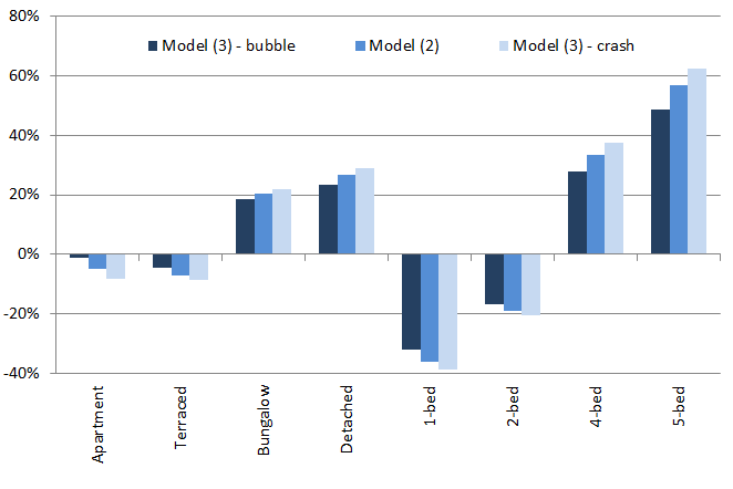
  1. In the sales segment, the marginal price of space rose substantially in the crash – put another way, the fall in price of a five-bedroom detached house (48% on average) was significantly smaller than that of a one-bedroom apartment (62%). The differential between these two properties increased from 118% to 164% nationally. An overview of the price differentials and how they changed between bubble and crash periods is given in the graph below.
  2. In the lettings segment, the opposite was the case: the marginal price of space fell in the crash. The differential between a five-bedroom property and a one-bedroom property narrowed from 97% to 82%.
  3. The geographic spread of both prices and rents was largely preserved across bubble and crash periods, falling only slightly in the models presented. The Gini coefficient of prices fell slightly (in Model (4), from 25% to 24%), similar to what happened that for rents (20% to 19%).
  4. As suggested by these Gini coefficients, it is clear that the spread of rents was significantly less than the spread in house prices in both bubble and crash periods. Most of this appears to be concentrated in high-amenity areas: while the 50:1 percentile ratios of prices and rents were similar (1.89 compared to 1.93), the 99:50 ratio was substantially greater in prices (3.02 compared to 1.86).
Price differentials associated with property types, for different periods (Ireland, 2007-2012)

What does all this mean? Is this useful at all, besides having pretty maps? Well, from a research point of view, the contrast between the first and second findings above suggests a model where income and substitution effects apply in different situations. Income effects appear to dominate where there is no outside option (demand for accommodation is income-inelastic if you are a renter): space in the crash is a luxury for tenants. Where there is an outside option – many would-be first-time buyers held out during this period – substitution effects kicked in: if you are going to buy, you might as well buy big. An idea for future research is modelling tenure choice with the real estate cycle in mind.

Location is ultimately a short-hand for a bundle of amenities, ranging from labour and consumer markets to social and natural capital amenities. The final finding – that the geographic spread of rents is in some sense constrained at the upper end of the distribution – is consistent with either renters under-valuing certain amenities, for example due to search costs, or with buyers over-valuing those amenities, for example due to fear about future access to an amenity that is in fixed supply (e.g. access to schools).

Buyer over-valuation due to a desire to lock in access to amenities would reasonably be at its most acute in a bubble and be seen in pro-cyclical pricing of attributes and amenities. This is an issue that Ed Glaeser, one of the leading urban economists, has been writing about using U.S. data for the period 1996-2006. He and his co-authors find evidence of pro-cyclical pricing of amenities. The evidence here, however, certainly in relation to attributes, is that pricing was counter-cyclical, suggesting that it is renter under-valuation at work. (I explore this is more detail in another paper.)

Lastly, the price and rent series constructed in the course of this research extend naturally to a price-to-rent ratio for each of Ireland’s 4,500 Census districts. Up next for me is the description and explanation of the significant variation over time and space in this fundamental barometer of the property market.