Ronan Lyons | Personal Website

Blog

We’re different, roysh? The decoupling of the Dublin property market

Today sees the launch of the fiftieth Daft Report, with a commentary by yours truly. To mark the occasion, and to mark five years of Ireland’s property market crash, Daft.ie and the All-Island Research Observatory at NUI Maynooth, have launched a property value heatmap tool. In a companion post to this one, I outline the tool, how it works and what it tells us about Ireland’s property market crash.

In this post, though, I’d like to highlight what’s in the report itself. The principal finding from Q2 was that conditions in the Dublin market do indeed look to have improved considerably since the start of the year. This has happened at a time when conditions elsewhere in the country are pretty much unchanged. It seems the decoupling of the Dublin property market from the rest of the country has already begun.

One reason for thinking this is price trends. While the average asking price in the capital did fall in Q2 (by 1.2%), taking the first half of the year as a whole, list prices in Dublin fell by less than 1%, compared with a fall of 10% in the second half of 2011. This is also in contrast to what is happening in rural Munster, Connacht & Ulster, where prices fell by roughly the same January-June as they did in July-December (7% vs. 8%). The graph below shows the six-month change in asking prices since 2006 for Dublin and for the “Ex-cities” category.
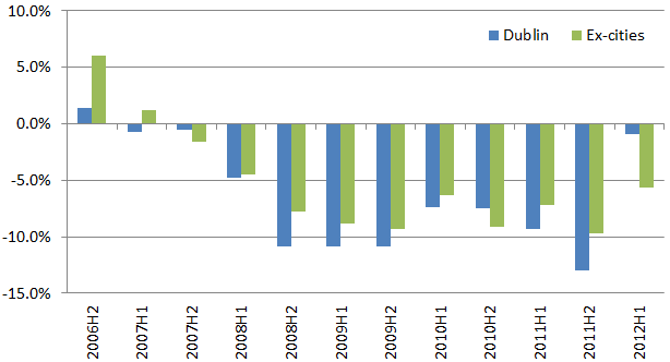
Six-month change in list prices, by region, 2006-2012

As I will tell anyone who’ll listen, though, recovery in the property market is less about prices and more about activity. We should not worry about house prices being low in Ireland – that’s good for competitiveness and mobility. We should worry about the number of transactions being too low. With barely 6,000 first-time buyer mortgages given out last year, in a country that is probably forming 30,000 new households a year, I think it’s safe to say transaction volumes in the Irish property market are unhealthily low.

There are two measures of activity included in the Daft Report, the stock sitting on the market over time, and – since January – the percentage of properties selling within a certain period of time. At less than 5,000, the total number of properties for sale in Dublin has fallen 35% from its peak. There are now fewer properties for sale in Dublin than at any time since the first half of 2007. By contrast, in Munster, there are 19,000 properties for sale, down only 12% from the peak stock on the market (21,000) and more than twice the early 2007 level.

The second figure below shows the proportion of households actively for sale at the moment – this doesn’t include vacant properties not listed for sale. Nationwide, the percentage has roughly fallen from 4% to 3% – but the spatial variation is revealing. About 1% of Dublin homes are for sale at the moment, compared to more than 5% in Munster, Connacht & Ulster.

Percentage of properties actively for sale (approximate, based on daft.ie listings), by region

But of course, the number of homes on the market is what might be termed endogenous. If prices stabilise or, wait for it, even rise in Dublin, there may be plenty of households holding back that will be tempted on to the market. So stock for sale is not without its limitations.

For me, the newest statistic in the Daft Report, the proportion of properties selling within a given number of months, is very interesting. It takes a bit of concentration to get the chart, when first presented with it – but the short version is, for property market recovery, one would want to see the lines rising over time. (Rising lines indicate that a greater proportion of properties are selling sooner.)

The graph below shows the proportion of properties selling within six months for Dublin and for Ireland’s four other cities as a group, at three points in time: last December, last March, and June. The proportion of properties selling within two months in the capital has risen from 25% last December to 34% now. Half of all properties listed in Dublin are sold within four months now, compared to six months late last year.
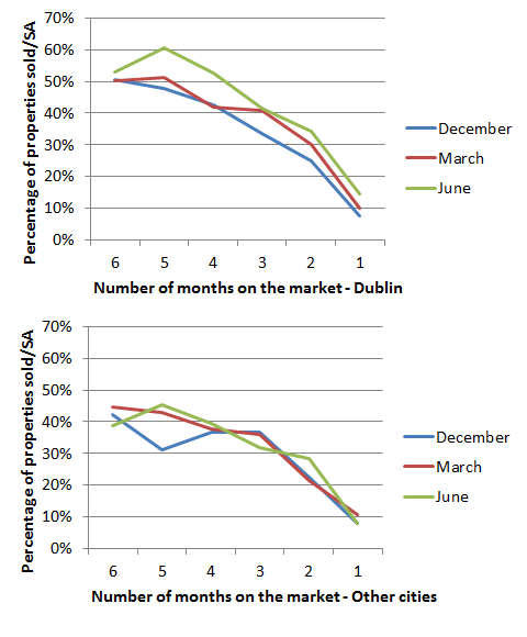
Percentage of properties selling (or sale agreed) within a given number of months

I haven’t really discussed Ireland’s other cities in this post, so let me do that now – their level of transactions are shown in the bottom half of the graph above. Interestingly, conditions are – on average – noticeably tougher, with more than half of all properties still unsold after not just six months, but a year. Still, with 40% of properties selling in four months, there is reasonable movement in those markets. In Munster, Connacht and Ulster (ex-cities), just 25% of properties sell with four months currently, the same proportion as late last year.

All these signs from Dublin may of course be a dead cat bounce, a false rally that brings out some of the latent supply on to the market, which – coupled with declining after-tax income and net emigration – pushes prices in the capital further down. However, Dublin prices are now down close to 60% from the peak, which when compared with incomes or more importantly rents, does seem close to “long-term economic value”. All thoughts, as ever, welcome.
Property prices rising?! Thoughts on the latest firesale auction

Ireland saw its first “fire sale” auction in April 2011 and over the months since then they have become an regular feature, with at least six auctions held by Allsop/Space in Dublin in that period. Last Autumn, I analysed the results of the first three auctions and concluded that, comparing the September auction to the April one, the price level had fallen.

To do this, I constructed a peak price for each property. I did this by using the “hedonic” model that underpins the Daft.ie Report, which effectively breaks every property’s value down into certain components, such as number of bedrooms, type of property, location and what quarter the property was listed.

Falling prices – so what?

In one sense, you may say: property prices were falling in Ireland last year, so what? Didn’t we all know that? The reason it concerned me at the time was that swings in property prices are typically driven by credit conditions and – at a macro level – the number of buyers relative to the number of properties being sold. In an auction setting, the number of properties being sold is fixed (there are about 60 residential properties sold in each fire-sale auction) and in a country of 4.5 million people, it should not be a struggle to find at least sixty buyers. More importantly, though, the buyers are mostly cash buyers, so their price level should not really change from auction to auction: if it was two thirds below the peak in April 2011, everything else being equal it should be roughly the same six months later.

The conclusion last September, however, was that the cash price level in the market was quite a bit lower in July/September (about 71% below peak) than it was in April (about 66% below peak). It’s important to remember that each additional percentage fall from the peak is proportionately greater at the time. So if a property valued at €500,000 at the peak falls 65%, it is worth €175,000. If it were to ultimately fall by 75% from the peak (to €125,000), that fall from €175,000 to €125,000 is not “just another 10%”, it’s a fall of almost 30%. For this reason, the fall from April to July/September was noteworthy.

So, halfway between the May and July auctions, what does the May 2012 auction tell us?

The latest fire-sale stats

As before, I’ve analysed each of the sixty-two residential lots sold in the May Allsop/Space fire-sale auction. For each one, I’ve jotted down the type, number of bedrooms and bathrooms and plugged its location into the model of the Irish property market to construct our best estimate of what it would have sold at, at the peak. Where rental information is given, I’ve noted this too as the ratio of annual rent to the price is – as established readers are probably sick of hearing – the single most important indicator in the property market.

Thus for the sample as a whole, there are two important metrics: the average yield (rent to price ratio) and the estimated typical fall from the peak (not an important measure in theory but one which everyone understands). Not only that, the sample can be divided into two groups: Dublin and the rest of the country. (This doesn’t quite do justice to the non-Dublin cities, which in my opinion are closer to Dublin in their supply and demand dynamics than they are to, say, the Upper Shannon region but a sample that size has its limits.)

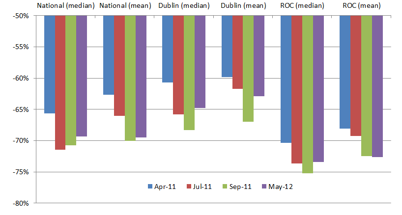
The key stat from the May 2012 auction is that the estimated typical fall from the peak was 69%. As is shown in the graph below, this marks a sort of inching upward of auction prices from their July 2011 level – at least when measured by the median. The difference between mean and median shows the limitations of the small sample size – a few outliers can skew conclusions.

Estimated average fall from the peak, by Allsop auction and region

Prices not falling? What?

What is interesting is how the extent to which Dublin prices are down from the peak has changed since September. Last April, the typical Dublin lot sold for 61% below its estimated peak price. By July, the discount was 66% while by September it was 68%. The May 2012 lots sold for an estimated 65% discount from peak prices. Whisper it, maybe, but Dublin cash prices may be creeping up. (Using the mean, rather than the median, doesn’t change the conclusion.)

Elsewhere in the country, though, the discount from the peak remains significantly larger: 73% in May 2012, compared to 74-75% in the July and September 2011 auctions. The evidence that Dublin is decoupling from the “rest-of-country” property market is beginning to stack up.

What about yields? The earlier auctions suggested something of a paradox: the desired yield was higher in Dublin than elsewhere in the country, despite people reasonably assuming that to get people to buy outside the largest markets you would need to offer them a risk premium in the form of a higher yield. The May 2012 figures, however, confirm what was suggested by the September 2011 figures: there is a significant risk premium emerging for properties outside Dublin. While the typical Dublin yield is between 8% and 8.5%, the yield elsewhere in the country is above 9.5%. The slight fall in yields in both Dublin and elsewhere is consistent with the price level at the fire-sale auctions rising slightly.

One shouldn’t forget that a large chunk of the residential transactions at the fire-sale auctions so far (perhaps 50 out of 400) have been from one development, Castleforbes Square near the O2 in the IFSC. This adds a further asterisk to the results so far (Dublin vs. rest of country comparisons are at least in some way Dublin city centre vs. rest of country comparisons) – but also creates an opportunity to compare like with like over time – something I’ll be doing anon.

In the meantime, though, it will be interesting to see what future fire-sale auctions throw and whether prices level off, rise or fall and how this continues to vary across the country.

PS. The full database of results from the firesale auctions is now up on the Allsop site here.

The Austerity Games: Ireland’s Fiscal Treaty referendum redux

A few important concepts have gone out the window as the debate in Ireland about the referendum on the Fiscal Compact has descended into political games. Perhaps the first victim was cause-and-effect, with the  mere correlation of banking debts and government deficits being translated by many into iron-cast causation.

A close second in the casualty list was the concept of opportunity cost: in other words, it’s not how bad or economically illiterate the Fiscal Compact is in and of itself, it’s about how attractive it is relative to the other options. As of now, the most important attribute of the Fiscal Compact is its ability to get Ireland the funding that it otherwise would not be able to get, to allow the country to gradually close the deficit. By 2020, that may be completely unimportant and we may want to ditch the Compact. But we are voting in 2012, not 2020.

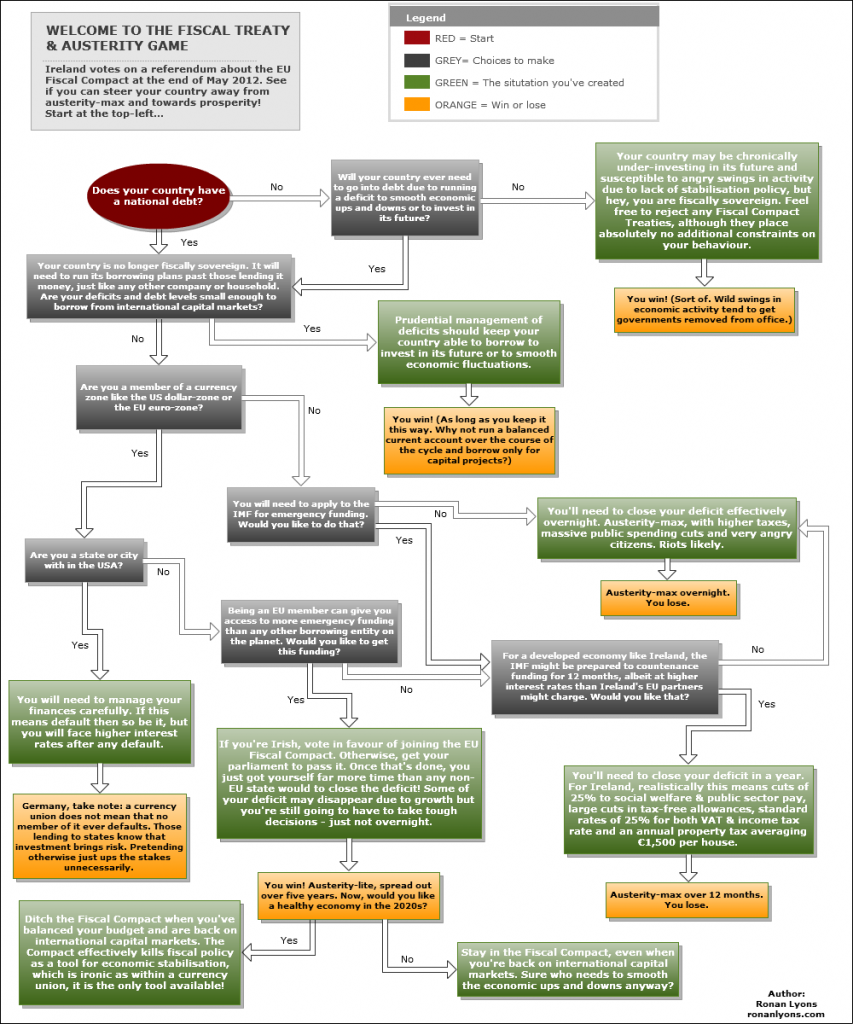
With all that in mind, I decided to develop a flow-chart that aims to illustrate the point that this is not about absolutes, it’s about options. If you click on the image, it should open up in a larger and more legible size. Hopefully you find it useful – if so, feel free to share it. If you’ve any suggested changes, pass them on and I’ll work them in.

Ireland's austerity choices

For more text on why the IMF will not be a panacea, Karl Whelan has an excellent blog post here.

Ireland’s property market – past, present and future

Over the past month, I’ve given a couple of talks on the Irish economy and the Irish property market in particular. While not exactly following the model of the “Single Transferable Speech” adopted by some, there was understandably – given the similar topics – a good deal of overlap between talks given to the public at the Central Dublin Library and an-EU sponsored conference on the Irish Economy in NUI Galway.

Both talks build on not only some of the academic research I’ve been doing recently but also material that only exists thanks to this blog and the feedback from readers, such as this post “Are we nearly there yet?“, comparing house prices now to their long-run level and to incomes and rents in Ireland since the 1970s.

A video of my talk in Galway is up on Vimeo here, while the slides are available both on Slideshare and on Scribd: both are embedded below also. All five sessions from the Galway conference are up on the Digital Revolutionaries Vimeo page. John McHale’s presentation contained a really neat graph with revisions to Ireland’s growth expectations by various bodies over the past 18 months, while Aidan Kane’s talk contains lots of fascinating information on Ireland’s historical debt issues, going waaaay back into the 1600s!

Ronan Lyons – The Irish property market from Digital Revolutionaries on Vimeo.

Wealth taxes and property taxes in Ireland: understanding the tax base

The end of the first quarter of 2012 saw not just the usual quarterly reports – such as the Q1 2012 Daft.ie House Price Report discussed elsewhere on the blog – but also the deadline for paying the €100 Household Charge. The charge has been the focus of a campaign of resistance that is surely more to do with the principle than its size (the increase in Band A motor tax was almost as large as the Household Charge but I don’t recall anyone complaining against that particular flat tax).

In fact that campaign has succeeded in one way already: while it had originally talked about the charge applying for 2-3 years on an interim, the Government is now not going to go through all this again and desperately wants to bring in a fairer property tax with Budget 2013 this coming December.

Where’s all the property wealth?

What sort of base is there for property tax? The latest Daft.ie Report gives county-by-county figures, which can be combined with information from 2006 and subsequent completions (or alternatively Census 2011 information) to reveal what wealth there is in residential real estate around the country.

The total amount of wealth in residential property peaked in 2007Q4, at €564bn. 37% of all this wealth (€208bn) was in Dublin (home to just 28.5% of households in 2006). A further €37bn was in the four other cities – their 6.5% being roughly in line with their 7% share of all households. Since then, the trickle of new completions has not been nearly enough to offset the fall in property values. The stock of homes as of Census 2006 has fallen in value from €525bn to €255bn, as of Q1 2012, while including the value of new completions in the years since 2006 increases the total value of all residential property to €294bn.

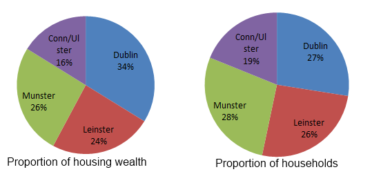
Households and housing wealth in Ireland

Dublin is now home to just under €100bn of housing wealth, as of early 2012, while the rest of Leinster and all of Munster are home to €70bn and €76bn in housing wealth respectively. Connacht and the three Ulster counties are home to about €48bn of housing wealth. The relative proportions that each of four regions makes up of Irish housing wealth and Irish households is shown in the two pie charts above – you can see that rural households need have no fear that any property tax will hit them hardest. Quite the reverse: any property tax will have to make sure that it doesn’t overly punish urban life, which is so crucial to subsidising the rest of the country.

Where’s all the wealth?

These are statistics that the political class would do well to heed. To recap our Econ1010, there are three main types of tax: those on incomes, those on consumption and those on wealth. Ireland is also home to some of the world’s most punitive rates of taxation on income and consumption, so hence there is increasing interest in wealth taxes.

There are four main forms of wealth: (1) cash/deposits, (2) equities/shares, (3) debt/bonds, and (4) real estate/property. In Ireland, as of 2006, deposits made up 10% of Irish wealth, equities a further 8%. Pension and investment funds – wealth holdings of unknown type but likely to be a mix of mainly equities and bonds – made up a further 11% of wealth. But it was property that was the overwhelming type of wealth in Ireland, making up 72% of all wealth. The vast bulk of this was residential property. And that picture is not likely to have changed substantially with so much of Irish equity wealth being invested in the banks, which are now all next to worthless.

So when people talk about taxing wealth in this country, they are talking principally about taxing the homes that we live in. In second place comes taxing the deposits we have in the bank. Make sure to mention this to the next person who says “We don’t need a property tax, we need a wealth tax”.

Signs of life or April Fool? The latest Daft Report

The latest Daft.ie House Price Report was released this morning and contains what may be surprising reading for some. Across three different metrics, there were signs of improved activity in the market in the first three months of the year. Given we sent out press releases to journalists before midday on April 1, I did worry that some of them might think it all just an April fool!

Increased optimism

But the signs are there. The fall in asking prices in the first three months of the year was, at 1.4%, the smallest fall in asking prices seen since prices started to fall in 2007. “Smallest fall” mightn’t sound like particularly good news for homeowners but what was particularly interesting was the fact that the average asking price rose in a number of regions.

Of 26 counties, the average asking price rose in eleven. An average price increasing at the county-level despite general falls is not unheard of – every other quarter might see one or two counties buck the trend, before falling again the next quarter. However, eleven in one quarter is as many county-level increases as the previous seven quarters put together.

Quarterly change in asking prices, by county, Q1 2012

Over on Manyeyes, I’ve visualised the changes over the last three months by county – an overview is given in the graph above. I think what’s interesting is that there is an obvious difference between the “bottom half” of the island, so to speak and the stretch from Galway over to Dublin. This less than random scattering of increases also suggests something more fundamental at work.

Shifting properties

Why are sellers in many parts of the country being more optimistic, though? Some – such as NAMA Wine Lake – believe that we can read very little into analysis of the actions of 27,000+ sellers and this is probably just noise. However, what are other metrics telling us? Sellers may be more optimistic if properties are shifting.

There is some evidence, particularly in Dublin and Leinster, that properties are shifting. The total number of properties for sale in Dublin is at its lowest since mid-2007 while the slow and steady decline in the stock sitting on the market in the rest of Leinster continues: there are now 14,000 properties for sale in the province, down from a peak of 18,000.

One other metric we’ve been pioneering in the Daft Report is the proportion of properties selling within a certain number of months. Typically, one might look at time-to-sell of the average property coming off the market but in a market where some properties have been up for three or more years, averages will get skewed and not give a fair indication to someone selling at a realistic price now of how long it will take to sell a property.

The report gives the proportion of properties selling within four months of listing, for both December (30%) and March (33%). And – like the average asking price and total stock on the market – it does suggest a slight improvement in conditions in the first few months of 2012. One third of properties now find a buyer within four months. In Dublin, that figure is 40%.

As I’ve been saying on radio this morning, I wouldn’t be take this report and run off popping open the champagne in the certainty of the market having stabilised. Instead, it’s a step in the right direction. Recovery in the property market is about activity (not prices). There’s evidence from today’s report that conditions did improve in the first quarter of the year – but that could easily be undone by trends between April and June. In particular, without sufficient lending by the banks, it’s unlikely we’ll see any stabilisation and recovery in the property market.

The daft-myhome conundrum

For those paying attention, there’s an obvious clash between what this Daft Report is saying and what the alternative report, by Myhome.ie, is saying. Whereas the Daft Report shows these three indications of improved market conditions, the Myhome report reads like the Daft Report from January: they’ve seen the largest fall in their series yet.

I learnt recently that there is one large methodological difference between the two reports. While the underlying methodology, hedonic regressions, is the same (and is also used by the CSO and was previously used by the ESRI), Myhome use all properties listed on their site come late March, no matter how long those properties have been listed. Asking prices however reflect sellers expectations and in my own opinion it should only be expectations formed (i.e. properties listed) during the quarter that are counted.

The other difference is the sample size available to each website. Daft has approximately 50% more properties listed for sale than Myhome and this is particularly pronounced outside Dublin (in the capital, to the best of my knowledge, it is pretty much even).

The Fiscal Compact – Vote Yes to Silliness (It’s all about the cash)

Last week, I outlined some of the many reasons why the EU’s Fiscal Compact should have been sent back to the drawing board when first seen by European leaders and their economic advisers. The experience of Spain since then sums these up pretty well. Spain had been given a target deficit of 4.4% of GDP this year. But it turns out the deficit is going to be closer to 6% of GDP.

The Pain in Spain

And with good cause. Firstly, the Spanish government doesn’t control GDP. It barely controls its own spending, let alone its own receipts. So what happens GDP should not be enshrined in laws and constitutions. The Fiscal Compact should be about government spending relative to government receipts, and not relative to some arbitrary concept of national accounting. For example, if the Government makes up about 50% of the economy, an 8.5% deficit relative to GDP actually means that 17% of spending is unfunded by current receipts.

Secondly, the Spanish government fears the effects of actually getting the deficit down to 4.4%. Halving that 17% unfunded spending down to just 9% in one year would mean cutting roughly 10% of Government spending… in one year! And all this while an economy is on the verge of recession, defeating the purpose of fiscal policy as one of the remaining tools of economic stabilisation for economies within a currency union.

However, Ireland does not have the luxury of saying no to the EU’s Fiscal Compact. The reason why is simple: cash. Until someone comes up with an alternate plan for sovereign funding as Ireland closes its deficit, borrowing from our EU partners and the IMF at what are – relative to the markets – low interest rates is the only game in town.

Bear in mind that our borrowing requirements are substantial. We’ve roughly €120bn in debt that needs to be rolled over at various intervals (although some of this is owed to Irish citizens, for example in the form of Prize Bonds) while an optimistic scenario sees us borrowing a further €14bn this year, €12bn next year, €10bn the year after… and so on meaning our national debt will be something like €170bn before it is close to stabilisation.

If not EU, who?

The plan, of course, was to go back to the markets in a substantial way next year. The question is, though, with the sovereign debt markets as they are, who would lend to Ireland at anything close to the 3% medium-term growth rate we are hoping for? (When national debt is the roughly the same size as the entire economy, the quickest way of assessing sustainability of debt is to compare the interest rate with the growth rate. If the interest rate is higher than growth, debt repayments would ultimately dwarf all other spending.)

Not only that, any institution that would lend to Ireland would attach conditions that would be effectively identical to the Fiscal Compact: i.e. Ireland’s government would need to get its spending back into balance and fast. The only alternative would be to balance the books overnight – this would be an extremely painful overnight adjustment, with public servants and social welfare recipients experiencing a dramatic reduction in their income.

Compared to that, the EU Fiscal Compact is quite attractive. The “path of adjustment” outlined in the Compact gives Ireland a full two decades upon exiting the bailout programme in 2015 to reduce the debt from, say, 120% of GDP, to 60%. That’s right – only in 2035 will the full EU Fiscal Compact and all its silliness apply to Ireland.

So, as an economist, I think the EU Fiscal Compact should be completely rewritten, this time with an understanding of fiscal policy. But it will go ahead, with or without Ireland’s assent in a referendum – the referendum is really only about whether Ireland wants to opt in for further funding from 2013 if needed. So as an Irish citizen, it has to be a yes for the EU Fiscal Compact.

Is Ireland a tax haven? Let’s ask investors

Over the last few days, there has been a lively debate on Ireland’s corporate tax affairs. It all started when Stephen Kinsella declared “Let’s say it out loud: Ireland is a tax haven”. Stephen pointed to this not to make the case that we should change our policy on the 12.5% rate – as he himself notes, “we need all the investment we can get”, but to highlight the threats associated with being dependent on tax motives for investment – in particular threats from the US political system, as it struggles with high unemployment and anger at big business.

Op-Ed Wars: It’s getting fiscal

The following day, and in the same newspaper, Brian Keegan of Chartered Accountants Ireland responded. Taking the OECD’s definition of how a region earns “tax haven” status, Brian went point by point through, outlining that Ireland has far more than nominal rates of tax, is very clear on tax issues, does share information with other jurisdictions and – at least according to the ECJ – does require a significant presence in the economy from taxpayers.

With a further response by Stephen, it’s now all kicked off on irisheconomy.ie. For me, the top comment has come from Kevin Denny: it’s probably not very useful to use a value-loaded term like “tax haven” because that gets people’s backs up and instead we should focus on the core point that Stephen was trying to make: it could well be the case that changes to tax codes, either domestically driven or more worryingly elsewhere (especially the US), could have a significant impact on Ireland’s investment performance.

Formally testing for the “elasticity of foreign direct investment with respect to the corporate tax infrastructure” is not an easy ask. In fact, while you might be able to measure the impact of the headline rate on FDI, there are a multitude of factors above and beyond the headline rate that comprise the corporate tax infrastructure – many of these are very difficult to measure.

So in the absence of that exercise, what can do we do? Well, a tax haven is only useful if companies know about it and are using it. So why don’t we ask just investors what they think of Ireland?

Why don’t we ask them?

Yesterday, a report I authored entitled “Investing in Ireland – A survey of foreign direct investors” was launched. The EIU report involved a survey of over 300 executives that had both responsibility for foreign direct investment decisions in their company and familiarity with Ireland. The survey was complemented by ten face-to-face interviews, with executives of companies that have significant operations here, such as Google, those with small operations here (such as Goldman Sachs) and those that could have chosen Ireland but didn’t (such as Kayak).

The survey asked respondents why they set up overseas, what they look for in potential investment locations, whether Government incentives matter (and it so which ones), and which locations (other than Ireland) are most attractive to them for FDI. It also asks them specifically about Ireland: what Ireland’s strengths and weaknesses are as a location for investment, if they have operations here why they came, if they are expanding why – and if they are not based here, why. The survey did not shirk the tax issue either: respondents were asked about the importance of the headline tax rate, the ability to transfer price and Ireland’s network of double taxation treaties.

There will of course always be quibbles about what exactly this sample represents but policymakers do not have the luxury of ignoring all surveys until the One True Survey comes along to answer all their questions. They need to act based on available information, knowing the strengths and weaknesses of that information. Like any good survey, a significant number of cohort questions were also asked of respondents so we do know a good deal about responding companies, including sector, size, number of countries and HQ country.

Ireland’s four pillars

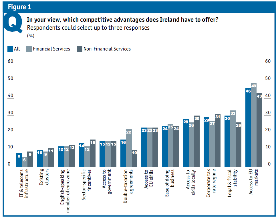
So what do investors say about Ireland? Is it all about the tax? Well… no. There are four reasons Ireland is so successful attracting investment – tax is but one. The foundation of Ireland’s competitiveness is market access: the principal reason companies go international is not to cut costs, it is to access new markets. Ireland offers companies outside the EU access to the world’s largest market. When asked what Ireland’s top three competitive advantages were, by far and away the most popular one was access to EU (and EMEA) markets.

But Ireland has no more access to the EU markets than Birmingham, Barcelona or Bavaria. What else does Ireland have? Access to skill is a second pillar of investment in to Ireland. This can sound like patting ourselves on the back – as Paul Duffy, CEO of Pfizer Ireland, says, “The reason that Pfizer has expanded in Ireland so extensively is the country’s proven ability, from as early as the 1960s, to deliver. The people are reliable and can handle complexity.” But the facts remain: Ireland has a larger proportion of young people with higher education than most other EU countries.  And crucially, Ireland is open to skill from elsewhere in the EU: access to skills from across the EU was chosen by almost as many respondents as one of Ireland’s competitive advantages (23%) as local skills (26%).

Ireland's competitive advantages, according to investors

A third key pillar is the regulatory environment – as you can see from the graph above (taken from the report), both the ease of doing business and Ireland’s legal and fiscal stability were highlighted by between one quarter and one third of investors.

The fourth pillar is tax. But even here, we should be careful not be caught like a rabbit staring at the headlines, so to speak. The headline corporate tax rate is just one component of Ireland’s corporate tax infrastructure. Perhaps more of interest to firms is the effective rate of corporate tax (i.e. once all allowances and loopholes have been applied). And while Ireland has one of the lowest headline rates of corporate tax in the Eurozone, its effective rate (as per the World Bank Doing Business report) is in line with the Eurozone average (both median and mean).

Other components of the tax infrastructure also matter – the network of double taxation treaties matters, particularly to financial services firms (22% of FS firms mentioned it as one of Ireland’s top three competitive advantages). And the ability to transfer price matters too – it was the third most important fiscal incentive for respondents, after the headline rate and double taxation treaties.

Tax Haven? Yes with an if, no with a but

While Stephen is right to highlight the risks of changes in the international taxation environment, Ireland is not a tax haven in the true sense of the word. Tax is not the only reason companies are here – if they were after low taxes on profits, there are plenty of jurisdictions that will charge them zero.

Firms have significant operations in Ireland because of the bundle of factors Ireland offers. I’m sorry I can’t give a more dramatic answer but this is the truth. But in a way, the answer is already dramatic enough. If Ireland were to lose its attractiveness completely on any one of the four factors highlighted – market access, skills, regulatory regime or tax – its phenomenal competitiveness at attracting FDI would be under threat.

So if by “tax haven” you mean that Ireland could no longer continue to attract investment if it had an uncompetitive tax infrastructure, then that it is true. Ireland is also a skill haven, an ease of doing business haven and a market access haven.

PS. There’s lots more to the EIU report than just tax – Ireland’s cost competitiveness, for example, the threat posed by high marginal rates of income tax or recent financial regulation, and indeed the plans they have to create new jobs here. I’ll probably post again on this report but if you get the chance, give the report a read – it’s not long.