Ronan Lyons | Personal Website

January 2013

Slow and steady: Ireland’s competitiveness, five years on

One of the mantras of Celtic Tiger Ireland was that it was a rip-off Republic. And indeed, by 2006, Ireland had overtaken Finland to become the most expensive place in the eurozone for consumer goods.

Mid-2008 marked a turning point, however, and the combination of global economic turmoil and local economic depression meant that prices fell for over 18 months from until early 2010. Regaining competitiveness with our currency peers does not necessarily involve deflation, however. It can instead be brought about by more moderate inflation in Ireland than in other parts of the eurozone.

And since 2010, that is what has been happening. The first graph below shows consumer price levels (as measured by HICP, which is designed to be comparable across EU member states) in four economic groupings. In addition to the eurozone core and Ireland, also shown are the PIGS countries (the “I” here refers to Italy) and the new EU member states (largely outside the Euro for the period shown).
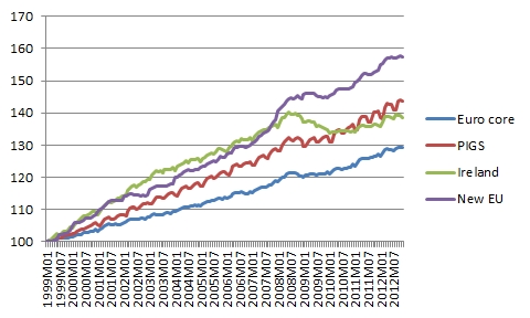
Consumer prices in selected EU regions, 1999-2012

In the first period, from 1999 to early 2004, Ireland acted like a new EU member state. Consumer prices increased by 22% in that period in Ireland, compared to 20% on average in the new EU states, 14% in the PIGS and 9% in the eurozone core. The second period, from early 2004 to mid-2008, Ireland actually saw more moderate growth in prices: 14%, in line with other PIGS (15%), below the new EU states (21%) but above the core (11%).

In the 50-odd months since August 2008, Ireland has been unique. Prices in Ireland have actually fallen by 1% in that period, while they have risen by almost 10% in both the PIGS and the new EU member states. In the Eurozone core, they have risen by 6% in the same period.

A direct comparison of Ireland and the eurozone core shows this competitive readjustment more clearly. The second graph below shows prices in Ireland relative to the eurozone core (=100) from 1999 on. Ireland’s price competitiveness worsened by 12 percentage points in that early period (up to 2003) and by another four percentage points (roughly) between then and 2008. In other words, it was the early years of the eurozone when the damage was done to Ireland’s cost competitiveness.
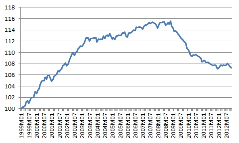
Prices in Ireland relative to Eurozone core (1999:1=100)

Of that 16-percentage point worsening in Ireland’s competitiveness, roughly half has since been eroded away. Compared to 1999, Ireland’s price levels have risen by 8 percentage points more than the Eurozone core. (This hides differences by particular categories of goods and services – a subtlety that matters a lot!)

In truth, that 8% figure probably overstates things slightly, as HICP excludes accommodation costs, which are the single biggest component of consumer expenditure.  Both rents and house prices in Ireland at currently at levels comparable to 2000, which is unlikely to be the case in any other European economy. Perhaps the only other candidate for such stable figures is Germany, but its property market has heated up the last two years, meaning costs are a good bit above 1999 levels.

In short, it has not been fun – as inflation is associated with expansion and deflation with contraction – but Ireland has put in five hard years of competitive readjustment. With prices on hold, so are wages, which boosts Ireland’s attractiveness for FDI. The sting in the tail is that with inflation throughout the eurozone so low, any further competitive gains are going to be even tougher and slower.
Another fine mess! So you want to value some properties…

Dear Government,

Well, you can’t say you weren’t warned. Yes, it was a noisy time for all concerned, with plenty of people telling you they didn’t want to pay any sort of property tax, no matter how cleverly designed. But still, there were those of us who argued all year long for a smart tax with a smart design. One that got lots of information into the system, to enable the auditing that means everyone is paying the fair amount. And perhaps more importantly one that kickstarted economic activity, rather than just another form of income reduction.

Really, the whole thing was quite messy. One of your own agencies, the Land Registry – who can tell you who owns what plot of land and what’s on the land – was apparently not consulted once. The debacle of the Household Charge shows the same happened GeoDirectory, which is a database of addresses and their physical locations, maintained by An Post and Ordnance Survey Ireland, two more of your agencies.

The mess continued on Budget Day, when people were told they had to self-assess the value of their homes – but were given no good incentive to do so well. Some of us advised giving people a tax credit in Year 1 to have their property professionally assessed and in their tax return give the Revenue Commissioners the kind of information needed for good auditing. Instead, the door was left wide open for a most unwelcome experiment in game theory, where neighbourhoods come together and coordinate their valuations at below-market rates, leaving Revenue Commissioners powerless to find any individual resident guilty of tax evasion. Which is why they have decided to value the properties themselves, apparently. But of course, not least thanks to a rather detail-sparse Property Price Register, they have none of the direct information needed to do this.

So, as you’re quite fond of saying yourself, we are where we are. Now what?

As it happens, I actually spend quite a bit of my time worrying about how best to value properties, segment the property market, etc. I’m actually just fresh from a renovation of some of those models. And the good news is that with the right information – in particular a property’s size and location – it’s quite easy to come up with reliable estimates of a property’s worth.

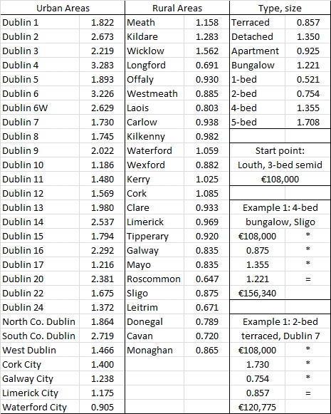
So, between breakfast and starting work this morning, I developed the following estimate of Irish property values. It should work in all areas, urban and rural, and for all major property types (apartments, bungalows, terraced, semi-d and detached) and sizes (one- to five-bedrooms).

So how does it work? To work out the value of a property, simply take the starting point (a 3-bed semi-d in Louth) and then multiply it by whatever factors you need. In particular, pick your county or urban area, if different; and pick your property type and size. So for a four-bed bungalow in Sligo, the €108,000 starting point is multiplied by 0.875 (prices in Sligo relative to Louth), by 1.355 (prices for 4-beds compared to 3-beds) and 1.221 (prices for bungalows, compared to semi-ds). Multiplying them all together gives an estimate of the property’s value in Q4 2012: roughly €156,000.

A rough guide for valuing an Irish property in early 2013 (see accompanying text)

Hopefully, Mr. Government, this table is of some use as you try and disentangle yourself from yet another fine mess!

Some notes on the above table:

  • Clearly, this is by no means meant to capture every last factor affecting property values. (One simple extension is number of bathrooms – roughly speaking, every additional bathroom is associated with a 10% higher price.) This model captures just under two-thirds of variation in house prices in Ireland, which – given the small number of factors included – is pretty good. But there’s still a third out there to explain. (Including effects for areas within counties would explain a significant chunk of the remaining variation, as it happens.) On average this will be right, and it will for the vast majority of cases be close but of course there are always properties that have unobserved factors that dwarf what matters for most homes. The method underpinning the figures above explicitly excludes outliers, so as to better improve the estimates for the vast majority of homes.
  • The table above is based on 60,000 listings on Daft.ie over the year 2012, and allows for the fact that prices varied throughout the year. “Aha”, a sceptic might say, “these are only asking prices and sure we all know they are [insert pet peeve here – too high, too low, etc]”. As it happens, some pretty detailed research comparing asking and transaction prices shows they move together remarkably tightly, once controls for location and size are included (as they are here). Properties that sell typically sell for about 10% less than their asking price, so for that reason the starting point of €108,000 is actually 90% of the figure returned by the model. The key thing about the model is what it tells us about relativities (prices between counties), not necessarily levels.
  • Lastly, lest there be any confusion, I offer this table as a public service but can’t offer it as any more than what it is – one academic economist’s analysis of the market.

A new dawn or the morning after the night before?

As with every New Year’s period, the end of 2012 and start of 2013 has brought a significant amount of taking stock, from the global economic outlook down to the prospects for the Irish property market. The “2012 in Review” Daft.ie Report has been released and marks an expansion of the range of information covered in the reports.

In particular, the report includes information from the Property Price Register in a like-for-like manner. As NAMAwinelake has noted, this is the first ever house price index for Ireland that has both the following features: (1) it is hedonic (i.e. compares like with like), (2) it includes both cash and mortgage-based transactions (current indices are based on either listings or just mortgages).

Asking price, closing price

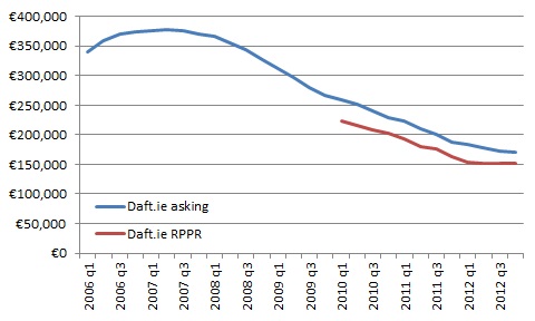
An important question is how closely does it match one based on asking prices? This is important for two reasons. Firstly, the Property Price Register only goes back to 2010, so for example for those who bought in the latter stages of the Celtic Tiger to understand the scale of their negative equity, other sources will be needed to understand what happened up to 2010. Secondly, as explained recently, quantity and quality are highly related when it comes to property market reports, so to have county- or size-specific findings, we will need more voluminous sources than the Residential Property Price Register (RPPR). A comprehensive dataset of listings (such as the daft.ie dataset) is of sufficient size to estimate in a statistically reliable way not just differences in prices over time but also across space.

Average house prices (asking and transactions), 2006-2012

Falling – but not so fast

So, how do the two measures compare? The first graph above shows the average house price (using county population weights) according to both the asking and price register datasets. It is clear that the average price from the price register is below the average list price – with the gap 13% on average. (Slight digression: it is not correct to interpret this 13% as the average gap between what someone asks and what someone gets, as transactions and listings do not automatically match up. Transactions from December are associated with listings from earlier in the year.)

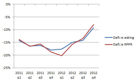
The second graph, below, compares the annual rate of change in house prices, as measured by asking prices and the price register. The key contribution of an index is how it measures changes over time, so this is the key comparison between the two. What is striking is how similar they are (the correlation between the two is over 97%). Both suggest that the year-on-year fall in prices accelerated from 14% in early 2011 to close to 20% by early 2012 – but that by end-2012, the rate of decline was below 10%.

Year-on-year change in house prices (asking and transactions), 2011-2012

So the conclusion seems to be that asking prices do actually do a very good job in mimicking transaction prices. For a range of purposes, from estimating negative equity to valuation of amenities, this is good news.

Town and country

But that is the answer to a relatively specific question. The broader question is what state is the property market in, as 2012 finishes and 2013 starts. The first graph above – particularly the RPPR line – points to a slow-down in price falls. Taking on board the point made above, that asking prices can shed light on regional trends not available form RPPR figures, asking prices tell us that the annual rate of change in prices varies hugely around the country.

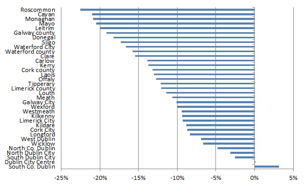
This is shown in the third graph, below. In rural property markets of Connacht and Ulster, prices are falling at rates of close to 20%. In Dublin, on the other hand, there are actually some segments – in particular, South County Dublin, which might be regarded as a bellwether (or alternatively, exceptional) – where asking prices are stable or even rising.

Annual change in asking prices, Q4 2012, by region

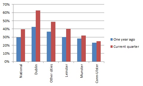
This picture of stabilising prices in the capital is reinforced when one looks at measures of market activity. The fourth and final graph shows the proportion of properties sale agreed (including those subsequently taken off the market) within four months of their original listing. The graph shows the figure currently, compared to the figure from a year ago.

Finding a buyer

While there is an improvement in all regions, that improvement is being driven by Dublin in particular, where almost two thirds of properties find a buyer within four months, and to a lesser extent by the other cities (half find a buyer). In Munster, Connacht and Ulster (outside urban areas), between two thirds and three quarters of properties are still on the market after four months, a proportion that has not fallen significantly in the last twelve months.

Proportion of properties selling within four months, by region

So on the face of it, the signs from Dublin are unambiguous – and one may conclude that 2013 will be a new dawn. The fly in the ointment is the extent to which the Government removing itself from fiddling around with the property market had the effect of fiddling with the market one last time.

Until the end of December, first-time buyers were entitled to generous income tax rebates on their mortgage interest relief. The removal of this very generous subsidy may have had the effect of taking some of the demand from 2013 and cramming it into 2012. The result may be that even the Dublin market finds it tough in the first half of 2013 and maybe even beyond, as would-be buyers also factor in a new annual property tax.

2013 might yet turn out to be not a new dawn, but the morning after the night before, a hangover (albeit on a much smaller scale) following the end of the (interest relief) party. My sense is that, for the major cities at least, this will not prove to be the case. But who knows?

Happy new year!