Last month, the OECD released its latest “Economic Outlook” publication, the benchmark publication for detailed economic statistics for developed countries around the world. The news it made related to the current state of the global economic recovery:
The world economic recovery may be slowing faster than previously anticipated… Growth in the Group of Seven countries is expected to be around 1½ per cent on an annualized basis in the second half of 2010 compared with the previous estimate of around 2½ per cent in the OECD’s May Economic Outlook.
I’d like to focus, however, on what economists might call the medium-term implications of the financial crisis and resulting recession across developed countries. In particular, it’s worth using the wealth of statistics the OECD produce to compare the overall effect of the past three years on the private and public sectors.
For the private sector, the relevant metric will be the change in output per unit of wages, i.e. for every €1,000 a company spends on employment now, how much output is it getting compared to three years ago? One would expect in general productivity to have been largely stagnant, but also wages. For the public sector, the relevant metric will be the change in the over budget, i.e. the change in a government’s total revenues, less the change in its total spending. Here, one would expect there to have been a deterioration, with taxes perhaps static at best but spending – as a percentage of the total economy – increasing.
A tough three years for the private sector in most countries
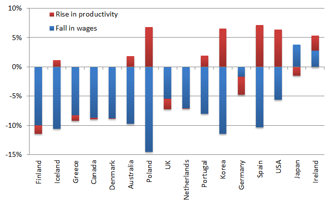
It has certainly been a tough three years for the private sector in most OECD countries. The typical country has seen productivity barely improve, up only 0.5% comparing 2010 to 2007. On the other hand, wages – far from being static as I had expected a priori – have actually surged ahead by 8.5%. This is to some extent driven by countries with their own currency, such as Iceland and Australia (wages up 10%) and Poland (wages up 15%). But it is also true of some eurozone countries, such as Finland and Spain, where wages have risen on average by 10% in the last three years.
At the same time, productivity increases have largely been negligible, outside a few countries such as Korea and the US (productivity up more than 6% in both). Certain countries have seen increases – like Spain and Poland – but by nowhere near the same amount as wages have gone up. The result means that for businesses, they are typically getting less per €1,000 paid in wages now than three years ago. This is shown in the graph below. (This is, of course, to say nothing about how workers/consumers feel about this. Their comparison is not wages vs. productivity, rather wages vs. inflation. Unemployment is also important to them – this is all irrelevant if you don’t have a job.)

The only exceptions to this rule are a varied bunch. In the USA, wages have risen 5.6% but productivity is up 6.4%, leaving firms marginally better off. In Japan, while productivity has fallen 1.5%, wages have fallen by 3.8% – not exactly a virtuous circle, but still firms are technically better off. The only country that has seen wages fall and productivity rise – a win-win all round, including for workers if prices fall by more – is Ireland, where productivity has increased by 2.5% on average, while wages have fallen by 2.8%.
Sustainable stimulus by the public sector?
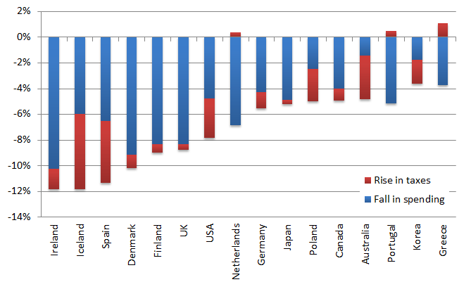
Government spending has increased over the past three years, as measured as a proportion of the economy, while the tax take has fallen slightly. This means that overall, there is quite a significant stimulus occurring in developed economies. For the typical OECD country, spending as a proportion of GDP has risen by five percentage points, while the tax take has fallen by one. This suggests a total stimulus in 2010, compared to 2007, of about six percentage points of GDP. A question far too big for a blog post is: how sustainable is this? And how reversible over coming years, when either the need for stimulus declines or the debt ceiling is hit? The overall change in government spending, relative to GDP, for various countries is shown in the graph below.

What is interesting here is a comparison of the fate of the PIGS countries. The three countries with the smallest relative stimulus include Greece and Portugal, as well as Korea – all below five percentage points of GDP. This reflects largely the high rates of debt in those countries already. In Spain and Ireland, however, along with Denmark and Iceland, the stimulus in 2010 has been above ten percentages points of GDP. In Ireland (and Denmark), the balance has been hugely towards government spending, with taxes largely staying in line with the overall economy size. This is problematic, as it’s much easier to end a stimulus that is tax-loaded than it is to end one that is spending-loaded, which generally means cutting jobs. The treatment of failed banks is also relevant: the government’s net liabilities have increased by 40 percentage points relative to GDP in Ireland, but by only four points in Denmark.
Clearly, these are just a couple of ways of looking at the impact of the last three years. But what can we take away from these figures?
- No quick wins: The private sector figures point to two productivity challenges. One is the core challenge: how do modern economies drive economic growth when there is no scope for “quick wins” in the form of catch-up or increasing population? I think experimental methods of measuring innovation – such as the EU’s Community Innovation Scoreboard – are a great start and combined with the digitisation of most of the economy over the coming generation will help. But in the meantime, the focus is on good management skills and flexible working practices.
- Productivity in services: The second is the more fundamental methodological problem: I suspect at least some of the fall in productivity is being driven by how we measure, for example, productivity in real estate services – which can fall if house prices fall. With over 80% of modern economies now in services, the challenge of measuring productivity is a huge one for the economics profession.
- Committing to spending: far too late for countries like Ireland and Greece, but the last three years have shown the folly of what could be termed an “accounting approach” to the public sector. When you only look at the totals coming in and going out, and when you have about half the economy run by one Government Department (Finance), you can easily end up where Ireland is, where all new current spending is effectively permanent and where about one third of its government expenditure not covered by revenues. Countries like the PIGS must take the opportunity presented by the crisis to change to an “economic approach” to the public sector, one that doesn’t look at costs only, but also at benefits. This involves the devolution of huge financial responsibility from central government to individual public service organisations.
Pavement Trauma ,
Good post Ronan, very interesting but for the sake of clarity please revamp the second graph to make the numbers positive, rather than negative. It really takes a moment to work out that a negative fall in spending actually means a rise(and ditto for taxes)!
Couldn’t agree more on the last point on committments to spending. A lot more spending programs (and tax cuts) should have built in review & reset dates, otherwise they continue on ad infinitum under their own momentum.
Ronan Lyons ,
Hi Pavement Trauma,
Unfortunately, the charts sort of need to be the way they are if it is visually to make sense. (That is: down is bad, up is good, in both charts.) I’ll see if I can clear up the text so it makes more sense.
Thanks for the comment,
Ronan.
John ,
Looking at the first chart, have wages in the private sector in Ireland only fallen by about 2.5% in the last 3 years?
Tom Grey ,
How about ordering the first chart countries the same as the second chart? Where the order clearly makes sense (I don’t see the ordering principle for the first chart).
I have to also say that I think an increase in wages is good, and a fall in wages is bad. So Poland’s +15% should be blue above my “good” line. I realize wage increases reduce company productivity, but from a worker’s point of view, the need for productivity at the company level is to increase the worker’s wages.
(From Marginal Revolution; really nice charts here. Thanks)
Ronan Lyons ,
Hi Tom,
Thanks – good suggestions re the charts. I did the charts here purely from a wage bill perspective, hence more wages = bad, but as you note, if it represents higher productivity, everyone wins, firm and worker.
Ronan.