Ronan Lyons | Personal Website

December 2008

Hair of the dog: With rents fallings, ECB cuts the only thing likely to drag yields above borrowing cost

The third and final (for 2008 anyway) instalment in the visualizations of Ireland’s property market takes a different look again to my recent posts on trends in prices and stock. Building on the measure of affordability on page 10 of each daft.ie rental report and a suggestion made on thepropertypin.com, it measures the gap between the expected yield and the cost of borrowing.

The result is here on Manyeyes. Blue means the cost of borrowing is greater than the expected yield, while brown means the opposite. Below, two quarters are shown – 2008 q3 and an estimate for 2009 q2.
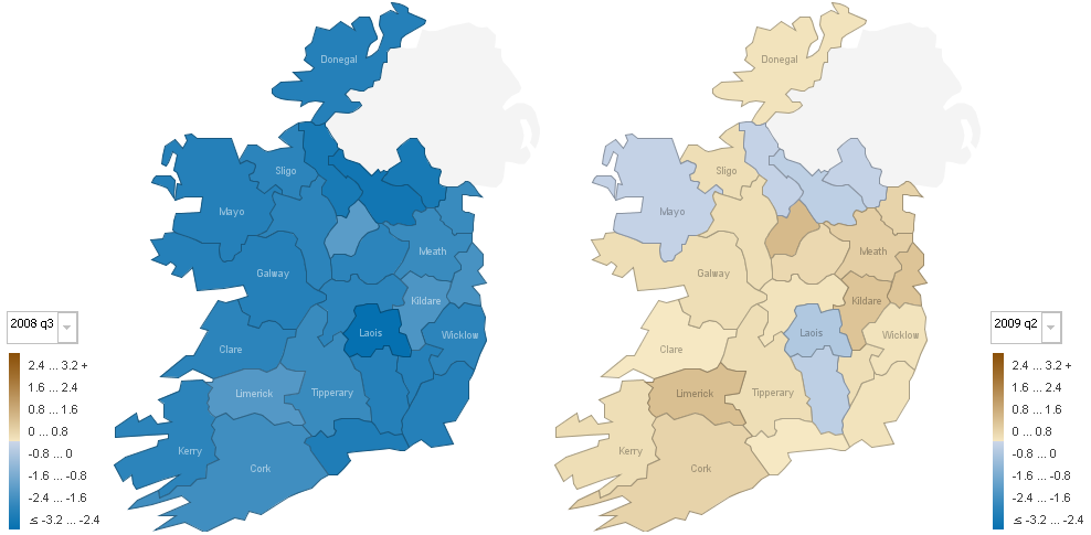
The gap between the cost of borrowing and property yields in Ireland, 2008 q3 and an estimate for 2009 q2

What is clear is if that one takes a measure of this gap as a measure of market disequilibrium, the market remains overpriced. (There are of course plenty of reasons why rents as a proportion of house prices may not be the only measure of a housing market in balance, particularly where rental markets are small or negligible, but bearing that in mind, let’s proceed…)

To look ahead and see if this mass of blue is likely to change any time soon, I made some assumptions about interest rates, asking prices and rents, based on what we know now. I assumed that interest rates fall to 1.5% in June 2009, and that house prices and rents both fall 5% quarter-on-quarter in the first six months of next year, as high levels of stock in both segments take their toll. I’ve also assumed landlords will still get 11 months of the 12 in rent and that the rate at which first-time buyers borrow remains about 1.1% above the ECB rate.

I’m sure there are plenty of ways people might disagree with particular aspects of those assumptions, but I think they make, if nothing, else a starting point for discussion. (Take them as a straw man if you don’t like them!) Anyway, if those assumptions were to be borne true over the coming six months, the first thing to note is that yields would be largely unaffected – i.e. not going in the direction they should be, up towards the equilibrium long-term average cost of borrowing somewhere north of 4%. (It should be pointed out at this stage that yields in certain market segments, e.g. West Dublin 1-beds, are already very close to 5%, so averages certainly hide some interesting sub-county variations. For more check out page 10 of the last Daft.ie report.)

However, a collapse in interest rate – albeit gradually – in a steady-as-she-goes ECB version of the Fed’s record peak to trough interest rate journey would have the not unexpected consequence of turning all those blue spots brown. Well, most of them anyway. Once again, the prognosis is not good for Leitrim and Cavan, two of the counties with among the worst stock overhang in the country, on a per capita basis. Even with interest rates collapsing to record lows, that would not be enough to make the rate of return on property greater than the cost of borrowing.

Is the cure the world is adopting a central banker’s version of the hair of the dog that bit you? Or are we entering a phase of the world economy where caution is so predominant that low interest rates are the appropriate response?
Ireland’s property overhang: Homeowners in Roscommon, Cavan and Leitrim beware

Last week, I posted a visualization of changes in asking prices for Irish property, since 2006, using the IBM Manyeyes tool. It’s proved very popular, not least with the crowd on thepropertypin.com. I’ve been happy to take suggestions on what’s the most important thing to be mapping and one suggestion – which ties in nicely with some ideas I’d been working on – was to measure the number of properties for sale by county, per capita.

What I’ve done for today’s visualization is take the number of permanent households from the 2006 Census – and taken it as fixed. I then plugged in county-level figures for the stock of property for sale from the Daft.ie database, and used the two to calculate an approximate percentage of the total property stock in a county that’s currently for sale. There are a range of potential data issues, from taking the Census figures as fixed to how to capture the size of new developments – it’s my hope that while all those issues are valid ones, the overall story should be relatively clear.

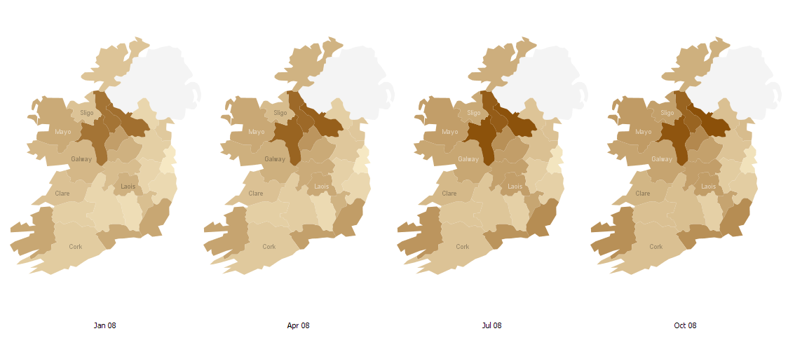
As before, the results are available for all to see and download on Manyeyes. It’s probably pretty clear what the overall message is, though, from the preview below (click on the picture to go through to Manyeyes):

Percentage of properties for sale, by county, Jan-Oct 2008

Some initial thoughts:

  • First off, Dublin seems among the least affected areas.
  • “Holiday home land”, i.e. counties like Wexford, Kerry, Cork, Donegal and Galway, have seen their overhang increase over the course of the year, but again, they are not the worst affected areas.
  • A trio of counties, Roscommon, Cavan and Leitrim, however, steal the show. Those three, as of start-October, had more than 10% of their properties for sale.

Data on how many properties have churned through the market since the start of 2007 would probably confirm that the hysteresis which has gripped the Irish property market is worst in some of the areas where the property boom probably reached its most irrational. As before, all comments, questions and thoughts welcome.

Brrr… Sure ’tis cold in Sligo: A heat-map of Ireland’s property prices since early 2007

As those who’ve checked out/had to put up with my many word clouds on various different topics from Wicklow genealogy to Barack Obama will testify, I’m always looking for new ways to present data and information. For those with similar interests, a useful tool in that regard is Manyeyes, a free data visualization service offered by IBM. First thing you might do when you click through is have a wander around some of its featured visualizations, such as the OECD economic outlook or the World Cup Finals.

You needn’t stop there, though, as once you’ve registered, you can upload datasets yourself and visualize them. What’s particularly cool, in my opinion, is the ability to do maps with subnational data points, e.g. for the USA, China and, somewhat surprisingly until you remember IBM’s presence in the country, Ireland.

So I plugged in some county-level statistics from the Daft.ie database, in particular the year-on-year % change in asking prices by county from the first quarter of 2007 to the third quarter of 2008. The results are available for all to see on Manyeyes – I haven’t been able to put a live visualization up here, but you can get a sneak preview below and indeed the whole shebang just by clicking on the picture.

E9a845ba-c221-11dd-9c2e-000255111976
Blog_this_caption

What, even clicking on the link is too much hassle? OK, here’s the lazyman’s version:

Heat-map of Ireland's property prices
Heat-map of asking prices for Irish property, 2007/2008

The easiest way to get the overview of the story – but with the minimum detail and surprise factor – is to go straight from 2007-q1 to 2008-q3. As you can see the map goes from totally brown to totally blue! But that naturally is hiding a lot of detail… So here are some other highlights on regional trends in Ireland’s property market:

  • Sligo is a constant underperformer – having enjoyed some of the smallest increases in the first half of 2007, it’s now suffering from some of the largest falls in 2008
  • Aside from Sligo, West Leinster was the first region in the country to suffer from falling house prices, in year on year terms, with Longford and Laois falling in year-on-year terms by (and we can pretty much throw in Westmeath there too, where prices were no higher than a year previously, in the same quarter)
  • In late 2007, asking prices in south-east Leinster (e.g. Carlow, Kilkenny) and neighbouring Munster counties (Tipperary, Waterford) were still rising in year-on-year terms.
  • Limerick was the last bastion of rising house prices. It’s the only county not to have registered two consecutive quarters of year-on-year falls in house prices… yet!
  • Have a look at 2007-q4… poor old Donegal just doesn’t get it! Even in early 2008, it was still at it. In Q3 2008, though, with prices down over 11% compared to a year earlier, it’s landing with a bang.

There are just some initial observations on the figures – overall, Manyeyes is a pretty useful tool, I’d have to say. I’d be interested in hearing anyone else’s observations on regional differences in price trends. What have I missed? Or indeed, what should I be heat-mapping?